Trending AI Video Prompts
Curated from Twitter/X — the hottest prompts for Sora, Runway, Kling, GPT Image 2 and more. Updated daily.
Sadie 🥀
@NameIsSudee
“A stunning full-body studio portrait of a young woman with fair skin, subtle freckles across her nose and cheeks, and piercing blue eyes. She has vibrant reddish-orange hair styled in a sleek high ponytail with some strands framing her face. She is wearing a shiny, metallic pink leotard with a deep scoop neckline, thin straps, and a high-cut leg line that glistens under the lights with iridescent reflections. She is sitting on a seamless pure white studio floor backdrop, legs extended straight forward with bare feet close together, toes pointed. Both hands are placed flat on the floor beside her hips for support, arms straight and relaxed. She has a neutral, confident facial expression with closed mouth, direct eye contact with the camera. Soft, even studio lighting with gentle highlights on her skin and the shiny fabric, minimal shadows, clean minimalist aesthetic, photorealistic, high detail, 8k resolution, sharp focus, fashion photography style”
Sadie 🥀
@NameIsSudee
“photorealistic full-body portrait of a beautiful young woman in her early 20s, fair skin with light freckles across nose and cheeks, long wavy chestnut brown hair cascading over shoulders, striking hazel eyes, full natural lips, subtle makeup, neutral serene expression, sitting on light wooden floor in elegant bedroom, one leg bent with knee raised, other leg extended forward, leaning slightly to the side, left hand resting on raised knee, right hand placed on white fluffy blanket beside her, wearing luxurious cream satin camisole with thin spaghetti straps and deep V-neckline showing cleavage, sage green high-waisted mini skirt, black strappy high-heeled sandals with ankle strap and delicate silver charms, silver necklace with ornate circular red gemstone pendant, thin red string bracelet on right wrist, silver anklet on left ankle, soft warm indoor lighting from floor lamp with gold base, white ornate vanity with mirror in background, white paneled walls, highly detailed, realistic skin texture, cinematic composition, sharp focus, 8k photorealism, natural depth of field”

Sadie 🥀
@NameIsSudee
“photorealistic portrait of a beautiful young woman in her early 20s with long straight ginger-red hair cascading down her back, pale freckled skin with visible freckles on her face, shoulders and arms, bright blue eyes, full red lips, wearing a white fluffy pom-pom scrunchie in her hair on the left side. She is kneeling on a modern gray fabric sofa in a bright, naturally lit room with a large window behind her, turning her upper body and head over her left shoulder to look directly at the camera with a soft, neutral expression. She is hugging a large Rilakkuma-style beige plush teddy bear with pink inner ears, black button eyes, black stitched nose and mouth, and a small red button on its chest, holding it close to her torso with both hands. She wears a tight white ribbed short-sleeve crop top, light blue boxer-style shorts covered in a repeating pattern of green avocados (some whole, some halved showing the pit), and sheer white thigh-high stockings. Red manicured fingernails. Soft natural daylight coming from the right side window, creating gentle highlights and realistic skin texture. High detail, sharp focus, realistic photography, 8k resolution, cinematic lighting, natural color grading”

Sadie 🥀
@NameIsSudee
“A photorealistic full-body portrait of a beautiful young woman in her mid-20s with fair skin, subtle freckles, and striking dark brown eyes, sitting cross-legged barefoot on the gray tiled floor of a modern bathroom. She has dark brown hair styled in a messy high top bun with loose wispy strands framing her face. She is smiling gently at the camera with a soft, natural expression. She wears a fitted pink ribbed camisole top with thin spaghetti straps, a sweetheart neckline with ruched detailing at the bust, and a black open-front knitted cardigan featuring small red strawberry embroidery on the sleeves and hem. She also wears matching pink ribbed shorts. Delicate gold necklace with a tiny pendant and a simple gold ring on her left ring finger. The bathroom background features large matte gray wall and floor tiles, a glass shower enclosure covered in realistic water droplets and condensation, a round mirror on the wall, a wooden floating shelf with potted plants and toiletries, a white bath towel hanging on a rack to the left, and a white woven bath mat on the floor. Soft natural daylight lighting coming from the side, cinematic composition, highly detailed textures on skin, fabric, and tiles, realistic depth of field, sharp focus, 8k resolution, masterpiece, best quality”

Nano Banana Labs
@NanoBanana_labs
“A photorealistic mixed-media collage portrait of a ruggedly handsome man attached in the uploaded reference image( Keep the face of the person 100% accurate from the reference image ), rendered on raw corrugated cardboard in a gritty urban street-art style. The artwork is a layered assemblage made from torn cardboard, ripped newspaper fragments, spray paint, stencil textures, vintage posters, barcode stickers, graffiti marks, and pop culture cutouts. His masculine face is hyper-detailed with realistic skin texture, piercing eyes, sharp jawline, subtle stubble, and glossy lips, while still appearing physically constructed from collaged paper elements and distressed materials. His thick textured hair blends into explosive street-art compositions with bold typography fragments like “URBAN RIOT”, “THE STREETS”, “NO GODS NO MASTERS”, and “LIVE FAST” integrated into the layers. Surrounding the portrait are stenciled images of Marilyn Monroe, anarchist symbols, NYC maps, police cars, fragmented price tags, punk icons, city signage, and vintage urban graphics scattered across the cardboard surface. The color palette uses aggressive high-contrast pop-art tones — neon pink, electric yellow, cobalt blue, black ink splashes, and white paint streaks — clashing against the natural brown cardboard texture. The composition is rich in tactile detail with visible torn edges, paint drips, scratches, splattered ink, weathered paper textures, and layered collage imperfections. Cinematic lighting, ultra-detailed realism, edgy contemporary gallery aesthetic, raw street culture energy, premium mixed-media artwork.”

Sadie 🥀
@NameIsSudee
“Photorealistic full-body studio portrait of a beautiful young woman in her early 20s, fair skin with visible light freckles on her face, shoulders, arms and chest, long wavy blonde hair with soft natural waves falling over her shoulders, light-colored eyes (blue-green) looking to the side with a neutral, slightly contemplative expression and gently parted lips. She wears a tight black sequined mini dress with thin spaghetti straps, low sweetheart neckline accentuating cleavage, covered in shiny black sequins and decorated with multiple pink fabric rose appliqués with sequin details on the bodice and skirt. Long dangling crystal earrings. Natural standing pose, arms relaxed at her sides, one hand lightly touching the dress. Background is a plain white wall filled with a large romantic cluster of heart-shaped metallic foil balloons in shiny red, matte pink, and nude beige colors, some with hanging ribbons. Soft even studio lighting, romantic Valentine's atmosphere, sharp focus, highly detailed textures, realistic photography style, 8k resolution, cinematic color grading”
Nano Banana Labs
@NanoBanana_labs
“A warm, low-angle shot displays a man attached in the uploaded reference image ( Keep the face of the person 100% accurate from the reference image ) with stubble and striking facial features reclining in a chair. He sports an off-white, patterne button-up shirt made of thin, slightly wrinkled fabric. He holds a drink in his other hand. The immediate foreground has a plurry, half-obscured orange fire that dominates the right side of the frame, casting flickering, specular highlights on his relaxed face and shirt. The background is dim, slightly out of focus, and color grading leans heavily into amber and brown hues, reinforcing a moody, intimate, and somewhat nostalgic nighttime ambience. There is noticeable digital grain and low contrast, suggesting capture with a modern digital camera or smartphone at high sensitivity, with chromatic haze added to enhance the atmospheric effects.”

Sadie 🥀
@NameIsSudee
“photorealistic close-up portrait of a beautiful young woman in her early 20s, fair skin with visible freckles across cheeks and nose, bright natural red hair tied in a high messy ponytail with loose wet strands clinging to her neck and face, skin glistening with realistic sweat droplets on forehead, cheeks, neck, shoulders and arms, wearing small blue wireless earbuds in both ears, exhausted post-workout expression with slightly parted lips, heavy breathing, tired yet determined eyes looking slightly to the right, wearing a tight-fitting heathered gray V-neck tank top damp with sweat and clinging to her athletic body, subtle cleavage visible, muscular yet feminine shoulders and arms, standing in a modern gym environment with black rubber flooring, racks of black dumbbells blurred in background, other indistinct gym-goers working out in soft focus, bright even indoor gym lighting with soft highlights on sweaty skin, ultra-detailed skin texture, realistic sweat physics, sharp focus on face and upper body, cinematic depth of field, 8k resolution, photorealistic, highly detailed, natural color grading, shot on Canon EOS R5”
Sadie 🥀
@NameIsSudee
“A photorealistic mirror selfie of a young woman with pale freckled skin and long red hair in a high ponytail. She is wearing a shimmery bronze string bikini and delicate gold jewelry. She is holding a dark smartphone taking the picture. The background is a room with warm peachy-tan walls, a closed door on the left, and a window with white trim on the right letting in natural daylight. There is a light carpet on the floor and a woven hamper in the corner. Warm, natural lighting, casual aesthetic.”

Synthia
@AIwithSynthia
“A bright, aesthetic lifestyle infographic showing a daily fitness routine laid out around a central human silhouette or timeline. Include visual steps like stretching, cardio, strength training, hydration, and cooldown, each represented with soft pastel illustrations. Add sections like “Morning Boost,” “Workout Essentials,” and “Recovery Tips.” Use soft shadows, rounded elements, and Instagram-friendly design. Include minimal icons, handwritten-style headings, and a warm, motivating tone.”

Sadie 🥀
@NameIsSudee
“A photorealistic, highly detailed image of a young woman with pale freckled skin and a long red side braid, wearing a glittering gold bikini and a white baseball cap. She is leaning casually against a weathered wooden railing on a pier, looking off to the side. The background is a bright, sunny coastal scene featuring clear turquoise ocean water, distant green islands, several small anchored boats, and softly blurred tourists in the background. Bright natural sunlight, sharp focus on the main subject, realistic textures.”
Gadgetify
@Gdgtify
“2x2 grid, do this for 4 famous asian foods. scene: "AR Culinary Deconstruction" target_variable: "$DISH_NAME" environment: "Clean white studio, soft overhead softbox" physical_layer: base: "Textured dark slate + clean white plate" food: "Semantic inference: Separate primary ingredients of $ DISH_NAME" actor: "1/12 scale plastic chef action figure posing with tools" prop: "Background Menu box displaying completed $ DISH_NAME" digital_layer: ui_type: "Frosted glass spatial UI cards" ui_content: "Semantic inference: Flavor radar chart for $ DISH_NAME" fx: "Floating flat graphic steam and herbs"”

Sadie 🥀
@NameIsSudee
“{ "prompt_details": { "subject": "Young woman with fair skin and light eyes. Striking copper-red hair styled in a voluminous high bun with loose, wavy face-framing tendrils. She has a neutral, contemplative expression.", "clothing_and_accessories": "Wearing a matching light grey or off-white lounge set consisting of a ribbed knit low-cut crop top, a matching ribbed long-sleeve bolero shrug, and high-waisted sweatpants. Accessorized with delicate gold jewelry: small hoop earrings, a thin chain necklace, and gold bracelets on her wrists.", "pose": "Standing with her body slightly angled, hands gently clasped in front of her waist, gazing slightly off-camera.", "setting": "An elegant, modern bathroom featuring cream-colored square wall tiles. A portion of a white bathtub is visible on the lower left. Behind the subject hangs a large, framed piece of abstract, colorful, cubist-style artwork.", "lighting": "Soft, diffused, warm indoor lighting that highlights the textures of the knit clothing and creates gentle, flattering shadows on the subject's face.", "style": "Photorealistic, candid lifestyle photography, high-resolution, soft editorial aesthetic." } }”

Sadie 🥀
@NameIsSudee
“A photorealistic portrait of a smiling young woman with long wavy brown hair, freckles, and red line-art tattoos on her forearms, wearing a light cream lace-trimmed camisole and a delicate pearl necklace. She is gently holding a tiny, fluffy orange tabby kitten in her cupped hands. The kitten is looking up at her face. They are in a cozy bedroom bathed in soft natural daylight from a window on the left. She is sitting on a bed covered with a blue and gold floral quilt. The blurred background features white walls with wainscoting, a wooden nightstand, and a macrame wall hanging. Soft focus, warm and intimate atmosphere, highly detailed.”

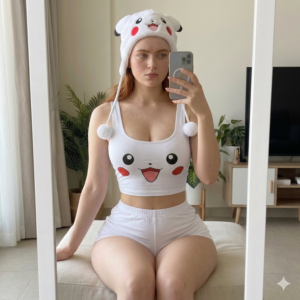
Sadie 🥀
@NameIsSudee
“Young woman with long straight red hair, pale skin, light freckles, and a neutral expression. She is taking a mirror selfie with a silver smartphone held in her right hand, while seated on a light beige soft ottoman. White novelty loungewear set. The top is a white ribbed crop top featuring a cartoon character face with large black eyes, red cheeks, and an open smiling mouth. She is wearing matching white fitted shorts and a plush white novelty hat with a similar cartoon face, soft 3D ears, and long strings ending in fluffy white pom-poms. Bright, modern indoor living space reflected in a large white-framed standing mirror. The background features a window with sheer beige curtains, a green potted plant in a wicker basket, a light-wood TV stand with a flat-screen television, and light-colored tiled flooring. Soft, diffused natural daylight streaming from the window, creating an even, airy, and bright atmosphere with gentle shadows. Candid realism, raw lifestyle photography, mirror selfie perspective, smartphone camera aesthetic, highly detailed, photorealistic, sharp focus on the reflection.”
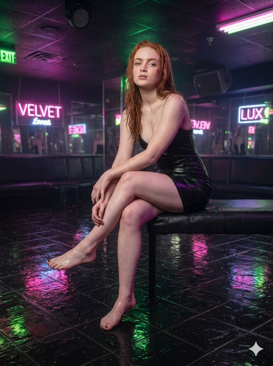
Sadie 🥀
@NameIsSudee
“{ "image_prompt": { "subject": "Young woman with long, wet red hair, pale skin, and subtle freckles.", "wardrobe": "Tight, black, wet-look mini slip dress with spaghetti straps. Barefoot with dark nail polish.", "action_and_pose": "Standing confidently with her right hand running through her wet hair and her left hand resting on her hip. Looking off-camera to the right. Skin appears glistening and wet.", "environment": "Dimly lit nightclub interior. Mirrored walls in the background reflecting the subject and the room. Dark leather booth seating visible along the back wall.", "lighting_and_effects": "Moody, cinematic lighting. Bright neon signs in the background including a pink 'VELVET' sign, a glowing 'LUX' sign, and a green 'EXIT' sign. Dark, wet tiled floor with highly saturated, glossy reflections of the pink, green, and purple neon lights.", "style": "Photorealistic, highly detailed, 8k resolution, modern digital photography, cinematic composition." }, "full_text_prompt": "A highly detailed, photorealistic image of a young woman with long wet red hair, pale skin, and freckles, standing barefoot in a dimly lit nightclub. She is wearing a tight, black, wet-look mini slip dress. Her skin and hair are glistening with water. She is posing with her right hand running through her hair and her left hand on her hip, looking off to the right side. The background features mirrored walls reflecting the room, dark leather booths, and vibrant neon signs including a pink 'VELVET' sign and a glowing 'LUX' sign. The floor consists of dark square tiles that are completely wet, creating vivid, glossy reflections of the pink, green, and purple neon lights. Cinematic lighting, 8k resolution, ultra-realistic." }”
AmirMušić
@AmirMushich
“[BRAND NAME]: The name of the brand. Goal: Generate a single, minimalist, and surreal image where a cloud is shaped like the brand's logo. 1. THE LOGO CLOUD - **Subject**: A massive, photorealistic cumulus cloud in the exact geometric shape of the [BRAND NAME] logo. - **Texture**: Puffy, soft, and voluminous with natural sunlight illuminating the edges. - **Volume**: 3D sculptural appearance with realistic shadows within the cloud folds to show depth. 2. ENVIRONMENT & BACKGROUND - **Sky**: A vast, clear, vibrant blue summer sky. - **Secondary Elements**: A few small, wispy, natural clouds scattered far in the background to enhance the sense of scale and realism. - **Lighting**: Bright, direct daylight coming from the side to create high-contrast highlights and shadows. 3. INTEGRATED BRANDING - **Text**: The word "[BRAND NAME]" written in a clean, bold white sans-serif font. - **Icon**: A small, flat white version of the brand's logo placed next to the text. - **Positioning**: The branding (text + logo) is centered at the bottom of the frame, acting as a subtle anchor to the giant cloud above. 4. STYLE - Surrealist photography, ultra-minimalist composition, high resolution, 8k, cinematic look, clean and airy vibe.”

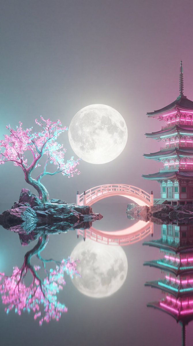
Viki
@churvikv
“A surreal, ethereal landscape at night featuring a serene body of water reflecting a large, luminous full moon in the center of a misty, soft-toned sky. On the left, a delicate tree with glowing pink and cyan blossoms stands on a rocky islet. On the right, an ornate, multi-tiered traditional Japanese pagoda glows with vibrant pink and teal neon light, perched atop a rocky formation. A graceful, arched bridge connects the two islets, also glowing with a soft pink light. The entire scene is bathed in a dreamy, vaporwave-inspired color palette of soft pinks, cyans, and hazy grays, with a gentle, magical atmosphere, high-detail 3D render, cinematic lighting, and a calm, tranquil aesthetic.”
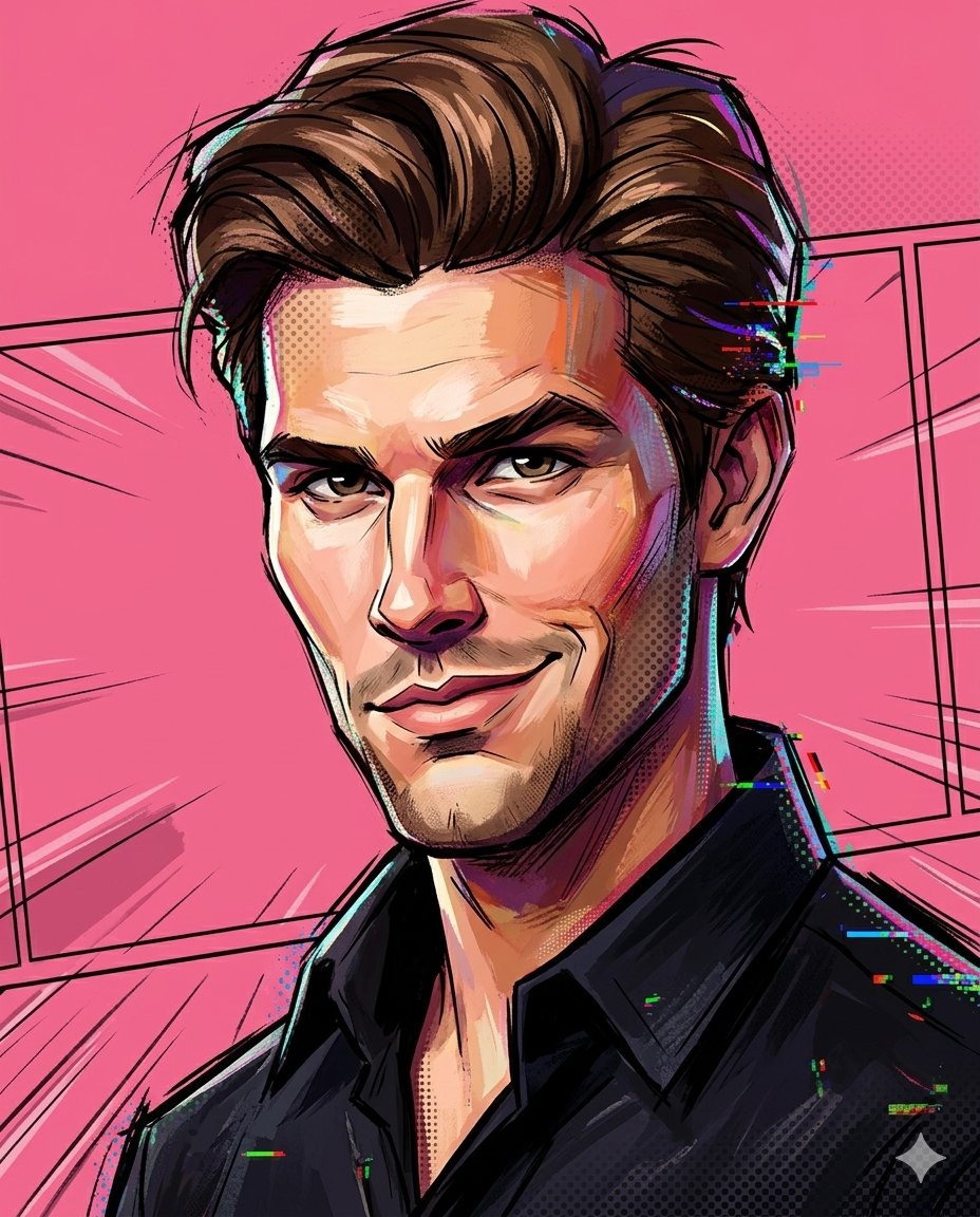
Nexora
@frametheory058
“A painterly exaggerated cartoon portrait combining sculpted 3D anatomy with hand-painted illustration textures, spider-verse inspired visual language, distorted facial geometry and expressive asymmetry, intentionally breaking realism while preserving general identity cues such as skin tone and hairstyle, bold line work mixed with painted shadows, halftone textures and color splashes graphic animated illustration aesthetic, solid pink studio background, frontal expressive pose, stylized lighting translated into brush-painted highlights, dynamic composition, rich paint texture and high-end hybrid cartoon render.”
AmirMušić
@AmirMushich
“[BRAND NAME] | [COLOR] Act as a 3D Motion Graphics Director and CGI Type Artist specializing in Japanese streetwear, Y2K motorsport aesthetics, and retro-tech hardware design. References: Kawasaki Racing livery, Yasuhiro Nightow title cards, Wipeout game UI, Peak Design × Japanese hardware collab. PHASE 0: BRAND LOGO INTELLIGENCE Retrieve the canonical logotype of [BRAND NAME] from training data. Identify its core typographic DNA — stroke weight, angle of italic lean, terminal style, any custom glyph cuts. If [BRAND NAME] uses a geometric or sans-serif wordmark — apply a 15 to 20° italic transformation while preserving all letterform proportions. If [BRAND NAME] already uses italic or script — preserve its native angle exactly. The goal is to translate the brand's typographic identity into a Japanese motorsport script register — aerodynamic, forward-leaning, built for speed. The letters must remain recognizable as [BRAND NAME]'s typeface, not replaced with a generic racing font. PHASE 1: PRIMARY TYPOGRAPHY SCULPTURE The wordmark of [BRAND NAME] is a fully 3D object — thick, physical, occupying real depth. Form language: each letter has a flat front face, beveled top and bottom edges with 30 to 45° chamfer cuts — the kind of angular geometry found on Japanese racing fairings and Kawasaki tank badges. Letters are slightly condensed and heavily italic — forward momentum is built into the geometry. The overall silhouette reads as one unified aerodynamic form — letters connect at their bases through a common ground plane, like a single cast aluminum piece. Material: high-gloss automotive lacquer in [COLOR] — the same paint system as a Japanese sports motorcycle tank. Surface properties: IOR 1.6, roughness 0.05, clear-coat depth visible. [COLOR] is pure and saturated in midtones, pushing toward near-white in specular peaks, pulling toward deep shadow in recessed zones and chamfer undersides. Reflections on the front face: subtle dark environment reflections — minimal and moody, just enough to show material depth. Top chamfer faces catch the primary light as bright highlight strips — the signature detail that defines 3D volume. PHASE 2: NEON WIRE OUTLINE SYSTEM A continuous neon tube traces the exact outer silhouette contour of the entire wordmark — every letter edge, every chamfer angle, every connecting point between letters. This is not a glow effect or a stroke — it is a physical glass neon tube, 4 to 6mm diameter, bent precisely to follow the letterform outline at a 3 to 5mm offset distance from the letter surface. Neon tube properties: glass tube body is semi-transparent — internal plasma glow visible through glass. Light emission: bright cold white light, color temperature 7000 to 8000K, pure white with very slight blue-cool bias. Emitted light creates a tight halo of illumination — 8 to 15mm radius soft glow on surrounding black void. The neon light bounces onto nearest letter surfaces — edges adjacent to the tube receive subtle cool white rim light. Tube construction: clean geometric bends at sharp corners, thin mounting wire clips at 3 to 4 points along its length — technically precise, like real neon sign hardware. PHASE 3: INTEGRATED TECHNICAL SCREEN A hardware screen panel is physically integrated with the wordmark — not a separate floating element, not placed at a distance. Integration logic — autonomously determine the most natural attachment point based on [BRAND NAME]'s logo geometry, choosing ONE of these integration modes: OVERLAP MODE — the screen panel is partially overlaid onto the rightmost or leftmost letter of the wordmark, as if mounted directly on the letter face. The letter surface shows through the screen's transparent zones. The screen edge cuts across the letter geometry deliberately — like a sticker or plate bolted onto the sculpture. EXTENSION MODE — the screen panel extends directly from the end of the final letter as a seamless continuation of the wordmark's ground plane — same italic angle, same 3D depth, as if the wordmark was designed with this panel as part of its original form. The transition from letter to screen feels like one continuous designed object. INSET MODE — the screen panel sits in a recess cut into one of the larger letters — as if a rectangular section of the letter body was removed and replaced with a hardware display. The letter geometry frames the screen on three sides. Screen physical construction: machined aluminum or brushed steel housing, same thickness as the letter sculpture — 8 to 12mm deep. The face is a slightly frosted acrylic panel backlit from within. The screen has the same italic angle as the wordmark — it is not upright, it leans with the composition. Screen contents rendered in precise small-scale detail: [BRAND NAME] in small clean technical sans-serif as primary label. An alphanumeric model code autonomously generated to feel authentic to [BRAND NAME]'s cultural language. 2 to 3 Japanese characters as secondary label. A horizontal LED progress bar — 4 to 6 rectangular segments, 1 to 2 lit in amber, others dark. A small ventilation grille or mesh pattern along one edge of the housing. The screen connects to the neon outline system via 1 to 2 thin cables — physical wires, 1 to 2mm diameter, with slight organic sag from gravity, running to the nearest neon tube mounting clip. PHASE 4: LIGHTING & ATMOSPHERE Background: pure absolute black (#000000 to #030303) — complete void, no ambient, no gradient, no surface. The composition is self-illuminated — only light sources are the neon tube emission, the screen's internal backlight, and a single narrow overhead spot. Overhead spot: focused directly above the wordmark center — illuminates top chamfer faces as bright highlight strips, falls off completely within 5 to 10cm of letterform edges, never reaches the background. Neon contribution: cool white rim light on adjacent letter edges, 8 to 15mm glow halo in surrounding void, reflected light on cables and screen housing. Screen contribution: the frosted acrylic face emits a soft diffused glow — slightly cooler than the neon, illuminating the immediate area of whichever letter the screen is integrated with. The amber LED segments create a warm micro-glow within the screen housing. No other light sources. No rim lights. No fill. Darkness is absolute outside self-illuminated zones. PHASE 5: COMPOSITION Aspect ratio: 1:1 square. The wordmark with integrated screen occupies the horizontal center — wider than tall, spreading laterally. The screen integration should feel like it was always part of the logo design — not an accessory bolted on, but a native component. Vertical position: slightly above center. The neon outline breaches the implied bounding box slightly at 1 to 2 points — confirming physical separation between neon tube and letter surface. Camera: slightly elevated 5 to 10° above center — reveals top chamfer faces and confirms 3D depth. Mild perspective. Depth of field: none — sharp across entire composition from screen detail to neon tube. PHASE 6: TECH SPECS Render: Octane Render or Redshift. Ray tracing: on — for accurate neon tube emission, screen backlight glow, glass refraction, cable shadows. Volumetric light: subtle around neon tube and screen face only — physically present glow without fogging the black void. Neon tube: dielectric glass material with physical light emission, not a glow map. Screen face: translucent acrylic with internal emissive backlight. Letter sculpture: automotive lacquer with full clear-coat depth. Anti-aliasing: maximum. Sampling: minimum 1024 samples. Film grain: none. Output feel: CGI title card or album cover — precision and atmosphere in equal measure. Darkness absolute. Neon and screen physically real.”

AmirMušić
@AmirMushich
“[BRAND NAME] | [COLOR] Act as a 3D Type Designer and CGI Artist working at the intersection of streetwear culture, Y2K aesthetics, and high-end digital sculpture. Your references: Nigo, Futura, Guccimaze, Soulwax art direction. --- PHASE 1: TYPOGRAPHIC CONCEPT Render the word or logotype [BRAND NAME] as a fully 3D sculptural object — not a flat text with extrusion, but a living, inflated, organic type sculpture. Style: Wildstyle graffiti DNA fused with inflatable balloon morphology. Letters are not separate — they flow into each other as one continuous organic mass. Each letterform has: bulbous pneumatic body as if inflated under high pressure from within, stretching the surface taut. Aggressive spike extensions — sharp tapered protrusions erupting between and around letters, directional, asymmetric, energetic, some long and blade-like, others short and thorn-like. Wildstyle overlaps — letters partially occlude each other creating depth layers, classic graffiti ambiguity where readability fights with visual complexity. Organic connective tissue — negative spaces between letters filled with stretched membrane forms, like rubber pulled between two inflated surfaces. --- PHASE 2: MATERIAL & SURFACE Single unified material across the entire sculpture — no color variation between letters. Material type: high-gloss latex / inflated rubber / soft silicone — the surface behaves like a balloon skin stretched to near-bursting point. Subsurface scattering: active — light penetrates slightly into the material, creating a translucent inner glow at thin edges and spike tips. Thinner areas read lighter, denser volumes read darker. Specular highlights: large, soft, slightly elongated — the kind you get on inflated latex, not hard plastic. Multiple secondary highlights in concave zones. Apply [COLOR] as the sole material color of the entire sculpture — this is non-negotiable. [COLOR] defines the pure midtone of the material. Highlights push toward the most luminous near-white version of [COLOR]. Shadow zones and deep crevices push toward the darkest most saturated version of [COLOR]. The entire chromatic range of the sculpture lives within the [COLOR] family — no hue deviation, no neutral grays. --- PHASE 3: COMPOSITION & STAGING Background: pure white (#FFFFFF) — clinical studio isolation. Zero texture, zero gradient. Shadow: none, or absolute minimum contact shadow directly beneath the sculpture — the object appears to float slightly. Orientation: horizontal spread — the sculpture is wider than tall, expanding laterally. Spike elements breach the invisible bounding box on all sides — top spikes reach upward, side extensions push outward. Camera angle: straight-on frontal, slightly elevated 5 to 10° above center — reveals the full typographic mass while showing the 3D depth of overlapping elements. Depth of field: none — sharp from foreground spikes to background letter bodies, every detail in focus. Scale feel: monumental — as if the sculpture is 2 meters wide in physical space, photographed in a white infinity studio. --- PHASE 4: TECH SPECS Render engine: Octane Render or Redshift — physically accurate subsurface scattering mandatory. Global illumination: large soft HDRI dome light, neutral white temperature 5500K. No directional shadows. No rim lights. No background elements. Ray tracing: on — for accurate specular and inter-reflection between letter surfaces. Anti-aliasing: maximum — edges must be razor-clean against white background. Output feel: this is a CGI product render, not AI art. Precision over expressionism. Aspect ratio: 1:1 square — centered composition with breathing room on all four sides.”

TechieSA
@TechieBySA
“Hyper-realistic Google Street View screenshot of [EVENT], exact modern Google Street View UI, dark info panel top-left showing location name and coordinates, white circular navigation arrows on the road surface, compass and pegman icon top-right, zoom controls, Google watermark bottom center, GPS coordinates bottom-right, floating black pill-shaped location label with pin icon on the building, blurred pedestrian faces, subtle fisheye barrel lens distortion, camera mounted at 2.5m height on car roof POV, overcast natural daylight, parked cars, ultra-detailed environment matching the fictional world, photorealistic. 16:9 dimension.”
Sadie 🥀
@NameIsSudee
“{ "prompt": { "subject": { "type": "female", "pose": "leaning forward with both hands resting on the hood of a car, arms extended, torso slightly angled, hips back, confident posture", "expression": "neutral to slightly pouty expression, relaxed facial muscles, focused gaze directed slightly off-camera", "face": "Use uploaded reference image, keep identity exact, natural facial proportions, realistic skin texture with visible pores and subtle imperfections, soft highlights from sunlight", "hair": "Use uploaded reference image, keep identity exact, long blonde hair with soft waves, styled with a wide headband, natural shine and slight movement", "body_details": "slim curvy build, natural posture, visible muscle tone, realistic skin tone with sunlit highlights and soft shadows" }, "clothing": { "outfit": "tight coffee brown mini dress with thin straps, body-contouring fit, smooth fabric with slight stretch and natural folds", "accessories": "wide light green headband, heart-shaped pendant necklace" }, "environment": { "location": "sandy beach area near a calm lake", "details": "blue water in background, sandy shore with scattered lounge chairs, umbrellas and kayaks, greenery and trees further back, bright sunny outdoor setting" }, "objects": { "primary": "yellow car hood in foreground with glossy surface reflecting light", "details": "car surface slightly worn with minor imperfections, metallic reflections from sunlight" }, "lighting": { "type": "direct natural sunlight", "direction": "strong top-side lighting", "quality": "bright high-contrast lighting with sharp shadows, warm highlights on skin, realistic exposure with slight glare on reflective surfaces" }, "camera": { "angle": "slightly low angle", "framing": "medium shot capturing subject from thighs up", "lens": "standard lens with mild background compression", "focus": "sharp focus on subject, background softly blurred" }, "style": { "aesthetic": "realistic lifestyle fashion photography", "color_tone": "vibrant natural tones with strong contrast between coffee brown outfit and sandy beach", "details": "high clarity, realistic textures, visible imperfections, no beautification" } } }”
Dominus Pellissier
@iamdomprompt
“{ "core_meta": { "image_type": "High-end mobile photograph", "art_medium": "Digital photography", "style_modifiers": [ "Apple ProRAW color science", "Deep Fusion texture enhancement", "Lifestyle editorial" ], "overall_mood": "Intimate and serene", "vibe": "Plandid (planned candid) influencer aesthetic", "quality_boosters": [ "8k resolution", "ultra-detailed skin texture", "Smart HDR 5" ] }, "subject": { "identity": { "subject_type": "Human", "gender": "Female", "age": "Mid-20s", "ethnicity": "Caucasian", "description": "A young woman with a fit, hourglass figure lying in a relaxed state." }, "anatomy_and_body": { "build_and_proportions": "Slender with defined waist and soft curves", "height_estimation_cm": "168", "skin_texture": "Natural skin pores, faint moles, and realistic goosebumps", "biological_features": { "vascularity_and_pigment": "Subtle vein visibility on feet, warm skin undertones", "subsurface_scattering": "High realism on skin surface under soft light", "skin_micro_texture": "Visible fine lines and skin grain", "eye_complexity": "N/A (subject's face is secondary to the overhead torso focus)" }, "unique_markings_and_tattoos": "None" }, "face_and_hair": { "face_structure": "Soft jawline", "eyes": "Softly closed or looking away", "eyebrows": "Groomed, natural", "lips": "Natural pink tone with slight sheen", "makeup": "No-makeup look, dewy skin", "hair": { "style": "Loose waves spread across the pillow", "color": "Honey blonde", "interaction_and_physics": "Hair strands catching light on the bedding" } }, "pose_and_action": { "description": "Lying flat on her back on soft bedding, captured from an overhead perspective.", "action": "Relaxing", "body_position": { "stance": "Supine", "upper_body_and_arms": "Arms stretched slightly outward, relaxed hands", "lower_body_and_legs": "Hips slightly tilted, legs relaxed and slightly parted", "hand_gestures": "Softly curled fingers" }, "gaze_direction": "Away from camera", "accuracy_constraints": [ "Anatomically correct limb placement", "Natural weight distribution on mattress" ] }, "wardrobe_and_inventory": { "clothing": { "top": { "type": "Ribbed tie-front cardigan", "fabric": "Fine knit cotton", "color": "Baby blue", "details": "Small tie-knot at the chest, visible ribbed texture" }, "bottom": { "type": "Lace thong", "fabric": "Intricate floral lace", "color": "Light blue", "details": "Pink silk bow at the waistband, delicate mesh details" }, "outerwear": "None", "footwear": "None", "fit_and_physics": "The knit top clings to the torso, light compression from the elastic bands" }, "accessories": { "eyewear": "None", "jewelry": [ "Thin silver chain necklace" ], "headwear": "None", "held_objects_and_props": [] } } }, "environment_and_scene": { "location": { "setting_type": "Modern luxury bedroom", "description": "Minimalist aesthetic with high-quality linens." }, "atmosphere": { "time_of_day": "Afternoon", "weather_conditions": "Clear, bright day" }, "spatial_elements": { "foreground_elements": [ "Edges of a white duvet" ], "background_elements": [ "Soft wrinkled bedsheets", "Pillow edges" ] }, "texture_details": { "environment": "High-thread-count cotton texture", "materials": "Soft fabric folds" } }, "camera_and_composition": { "frame": { "aspect_ratio": "4:3", "resolution": "48MP", "orientation": "Vertical" }, "composition": { "shot_type": "Overhead mid-shot", "camera_angle": "High angle, 90 degrees down", "framing_guide": "Rule of thirds applied to the torso", "perspective": "Point-of-view looking down", "depth_and_focus": "Deep focus on the subject, slight blur on the extreme edges of the bed", "symmetry_and_balance": "Balanced center-weighted composition" }, "hardware_simulation": { "camera_model": "iPhone 16 Pro Max", "lens_type": "Main Wide Lens", "focal_length_mm": "24mm", "phone_visibility": "Hidden" }, "camera_settings": { "aperture": "f/1.78", "shutter_speed": "1/120s", "iso": "80", "white_balance": "Auto (Natural)", "dynamic_range": "Smart HDR" } }, "lighting_and_color": { "lighting": { "setup_type": "Natural window light", "primary_source": "Large side window", "secondary_source": "Reflected light from white walls", "direction": "Side-lit from 10 o'clock position", "shadow_quality": "Soft, diffused, gentle fall-off", "highlights": "Natural skin glow, slight sheen on the ribbed top", "lighting_interaction": "Light filtering through fabric fibers" }, "color_grading": { "color_mode": "Apple ProRAW", "palette": "Pastel blues, soft pinks, creamy whites", "color_temperature": "5500K (Neutral)", "contrast_curve": "Natural, preserving shadow detail", "lut_application": "None (Native iPhone look)" } }, "post_processing_and_fx": { "rendering": { "engine": "Photorealistic Path Tracing", "approach": "Physical-based rendering" }, "optical_artifacts": { "chromatic_aberration": "Minimal", "vignetting": "Slight corner darkening (natural)", "lens_flare": "None", "bokeh_quality": "Computational portrait blur" }, "sensor_atmosphere": { "iso_noise_structure": "Very fine digital grain in deep shadows", "sensor_bloom": "None", "air_particles_and_haze": "Clear indoor air" }, "imperfections_and_realism": "Slightly blown out highlights on white sheets, realistic skin pores, natural fabric wrinkles" }, "advanced_controls": { "controlnet": { "pose_control": { "model_type": "OpenPose", "purpose": "Accurate supine laying position", "constraints": [ "Overhead view only" ], "recommended_weight": 0.8 }, "depth_control": { "model_type": "ZoeDepth", "purpose": "Accurate fabric folds on bed", "constraints": [], "recommended_weight": 0.5 } } }, "negatives": { "artifact_suppression": [ "professional camera", "DSLR", "bokeh balls", "anamorphic", "cinema lighting", "studio lighting", "perfectly smooth skin", "3d render look" ], "subject_excludes": [ "facial distortion", "extra limbs", "floating body" ], "forbid": [ "p*rnographic act", "explicit n*dity" ] }, "final_prompt_string": "Shot on iPhone 16 Pro Max, 24mm f/1.78. Overhead mid-shot of a woman lying on a bed. She wears a baby blue ribbed tie-front cardigan and matching blue floral lace panties with a tiny pink bow. Pink sheer thigh-high stockings. Soft natural window lighting, light blue and white color palette. Sharp focus on skin texture and knit fabric, Apple ProRAW, Deep Fusion details, Smart HDR, 9:16 aspect ratio, highly realistic lifestyle photography, intimate mood, natural skin pores, minor digital noise in shadows.", "final_director_notes": "Focus on the interplay between the ribbed texture of the knit top and the delicate lace of the bottoms. The overhead angle must feel like a casual snap taken from a standing height. Maintain the 'Smart HDR' look by ensuring that even in the white highlights of the bedding, there is still visible texture." }”
AmirMušić
@AmirMushich
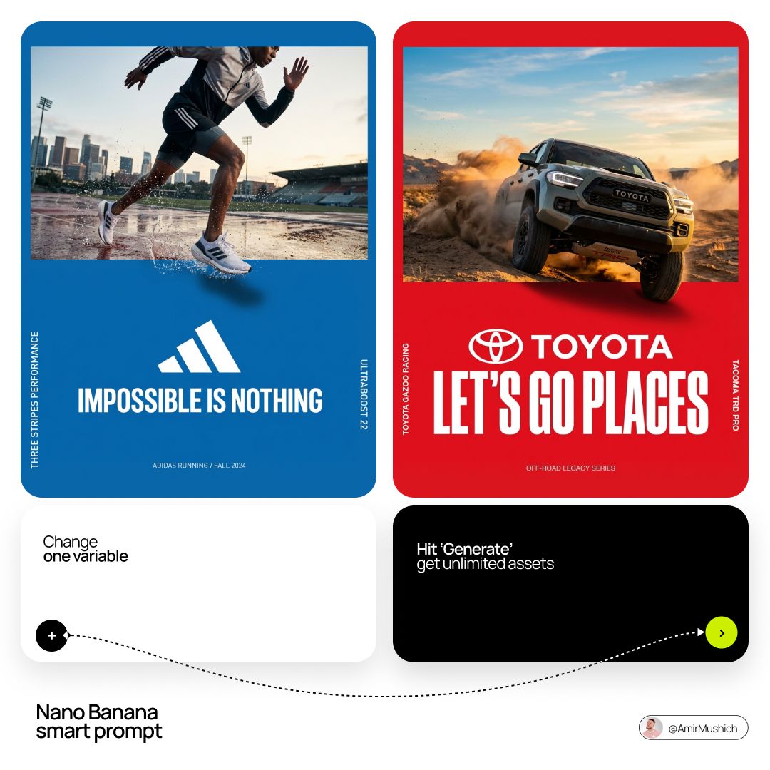
“[BRAND NAME]. Act as a World-Class Editorial Designer. PHASE 1: DYNAMIC SUBJECT LOGIC. - Subject Selection: Autonomously analyze [BRAND NAME]. - Layering (The Sandwich Effect): Interweave the subject with background shapes. Some parts of the car/person must be hidden behind geometric blocks, while other parts (wheels, limbs, props) must overlap them to create 3D depth. PHASE 2: GRID & GEOMETRY. - Layout: A clean 2x2 grid composition. - Overlays: Superimpose large, bold geometric arcs and circles over the grid. - Visual Balance: Place one iconic product prop (e.g., a floating key fob for cars or a ball for sports) in a separate quadrant to balance the subject. PHASE 3: SOPHISTICATED MUTED PALETTE. - Color Direction: DO NOT use aggressive neon or oversaturated colors. - Palette: Identify the core colors of [BRAND NAME] and shift them to a "Sophisticated Muted" spectrum. - Tones: Use desaturated, earthy, or "dusty" versions of the brand colors (e.g., instead of hot pink, use dusty rose; instead of bright mint, use sage green; instead of royal blue, use slate blue). - Finish: Matte, flat color blocks with zero gradients. PHASE 4: PHOTOGRAPHY & LIGHTING. - Subject Style: High-end commercial studio photography. - Lighting: Soft, diffused studio lighting with gentle highlights. No harsh shadows. - Integration: The subject must feel physically embedded into the graphic grid. PHASE 5: MINIMALIST BRANDING.”
AmirMušić
@AmirMushich
“[BRAND NAME] Act as a Senior Vector Graphic Designer specializing in Y2K Japanese streetwear badge design. Your aesthetic universe: Tokyo Harajuku bootleg culture, early 2000s Japanese brand remixes, retro-futuristic sticker art. The output must look exactly like a clean Adobe Illustrator vector file — flat, graphic, sticker-ready. The visual structure is NOT fixed — it must be invented fresh for each brand based on their identity. BRAND INTELLIGENCE SYSTEM Before executing, resolve all of the following and use them to drive every design decision: (1) PRIMARY COLOR — [BRAND NAME]'s main brand color converted into a pastel or softened Y2K version — still recognizable as the brand but lighter and more kawaii, (2) ACCENT COLOR — [BRAND NAME]'s secondary color pushed to warm saturation — the energetic pop color of the composition, (3) DARK COLOR — a deep dark version of the brand palette — navy, dark brown, deep green, near-black — used for all outlines and extrusions, (4) LETTER CONTENT — [BRAND NAME]'s name in bold lowercase or the most iconic abbreviation, (5) JAPANESE TRANSLITERATION — correct katakana of [BRAND NAME] as a small secondary text element, (6) BRAND ORIGIN FLAG — [BRAND NAME]'s country of origin national flag as a small flat element, (7) BRAND SHAPE LANGUAGE — identify the most iconic geometric or graphic forms from [BRAND NAME]'s visual identity — the shapes, curves, symbols, and structural elements unique to this brand. These shapes become the orbital, background, and decorative elements of the badge — replacing generic ovals with brand-specific geometry, (8) BRAND CULTURAL SYMBOLS — identify 1–2 small iconic objects or symbols from [BRAND NAME]'s world that can be rendered as tiny flat illustrations within the badge — not the logo itself but objects associated with the brand's universe, (9) COMPOSITION LOGIC — based on all resolved parameters above, autonomously design the structural layout of the badge. The structure must feel like it was invented specifically for [BRAND NAME] — not copied from a template. Ask: what shapes from this brand's identity could orbit the letters? What geometry feels native to this brand? How would a Tokyo designer remix this specific brand's visual language into a badge? PHASE 1: CANVAS 1:1 square canvas. Background: flat off-white or warm light grey. Completely empty. No texture. No gradient. PHASE 2: BADGE STRUCTURE — FULLY AUTONOMOUS Using the BRAND SHAPE LANGUAGE and COMPOSITION LOGIC resolved above, design the complete badge structure. The only fixed rules are: the badge must have a central lettering element, surrounding geometric shapes that interact with the letters through z-layer stacking, at least one element that passes both behind and in front of the letters creating depth, and the overall silhouette must read as a unified badge or patch shape. Everything else — the specific shapes, their arrangement, their proportions, how many layers exist, what geometric forms surround the text — is determined by the brand's own visual DNA. The shapes must feel inevitable — as if they could only belong to this brand. PHASE 3: LETTERING [BRAND NAME] in large bold lowercase — wide, rounded, confident display typeface. Flat PRIMARY COLOR fill. Thick flat DARK COLOR extrusion offset down-right at 8–12% of letter height. Bold DARK COLOR outline. No gradients. No rendering. The letters are the anchor of the entire composition. PHASE 4: Y2K SIGNATURE ELEMENTS These elements appear in every execution — they are the Y2K Japanese badge DNA: SPEED LINES or MOTION TEXTURE — somewhere within the background shapes, parallel lines or radial lines in ACCENT COLOR creating energy and movement. 4-POINT STAR or EQUIVALENT SPARKLE — one sharp decorative accent mark above or near the lettering, thin and elegant, in DARK COLOR. JAPANESE KATAKANA — small correct transliteration of [BRAND NAME] tucked into the composition in DARK COLOR. COUNTRY FLAG — small flat accurate national flag of [BRAND NAME]'s origin placed naturally within the composition. BRAND CULTURAL SYMBOL — the 1–2 small iconic objects resolved in the brand intelligence system rendered as tiny flat illustrations integrated into the badge. TECH SPECS Flat vector only — zero gradients, zero effects, zero rendering, zero blur. Clean crisp edges throughout. Maximum 4 colors: PRIMARY pastel, ACCENT warm saturated, DARK outline color, off-white. The badge must feel like a collectible sticker or embroidered patch. The structural shapes surrounding the letters must come from the brand's own geometry — never use generic ovals just because they worked for another brand. Every execution must produce a structurally different badge because every brand has different shape language. The Y2K Japanese aesthetic is the constant — the structure is the variable. Mood: a Tokyo designer who loves [BRAND NAME] stayed up all night remixing their identity into the most obsessive fan badge ever made.”

AmirMušić
@AmirMushich
“[BRAND NAME] Act as a Senior Street Culture Art Director and Editorial Designer specializing in authentic underground magazine covers and campaign posters that feel documentary rather than commercial. Your reference universe: Thrasher Magazine, i-D, The Face, Dazed — raw, real, typographically bold. BRAND INTELLIGENCE SYSTEM Before executing, resolve: (1) HERO SUBJECT — identify the most authentic human archetype or iconic product moment associated with [BRAND NAME]'s world. Autonomously determine what this looks like based purely on the brand's identity — a person interacting with the brand's hero product in their most natural environment, or the hero product itself as the sole subject if no human archetype is more powerful. The subject must feel like it belongs to this brand's specific world — not borrowed from another brand's cultural universe. Never default to skateboarding, skating, or street sport unless [BRAND NAME] is specifically and primarily a skate brand, (2) ENVIRONMENT — the most iconic real-world location context for [BRAND NAME]'s subject — not a studio, always a real place with atmosphere: a rooftop, a street, a race track, a kitchen, a parking lot, a coastline, a salon, a garage, a runway, (3) BRAND WORDMARK STYLE — identify how [BRAND NAME]'s name would look rendered as a rough hand-painted or chalk brushstroke headline — the texture and character of the lettering must feel native to the brand's specific subculture and communication style, (4) NEON ACCENT COLOR — identify one single neon or highly saturated accent color that feels culturally connected to [BRAND NAME]'s world — this will be used exclusively for the graffiti tag overlay and nowhere else, (5) QUOTE LINE — autonomously generate a short authentic-sounding quote or phrase in [BRAND NAME]'s voice — 4–6 words, raw and real, not corporate, not generic. PHASE 1: PHOTOGRAPHY BASE The entire image is built on a real location photograph — not a studio shot, not a white background, not a cyclorama. The environment resolved in the brand intelligence system is the setting. Natural or available light only — no softboxes, no controlled studio lighting. The light should feel like it was taken at golden hour, overcast day, or in existing ambient conditions. Camera angle: dynamic and committed — low angle looking up for power, or a dramatic dutch tilt for tension, never flat eye-level. The subject is captured at peak energy — the single most alive frame of the action or moment. The photograph fills the entire canvas edge to edge with no padding. Color grade: slightly pushed contrast, natural colors preserved, filmic grain, not over-processed. This photograph must feel like it was taken by a photographer who was actually there — not staged, not art directed to death. PHASE 2: BRAND LOGO BRUSHSTROKE — CRITICAL Autonomously identify [BRAND NAME]'s primary icon mark or logo symbol — the exact recognizable shape that represents this brand visually. Render this logo mark as a large hand-painted brushstroke version — as if a skilled street artist took a wide brush loaded with paint and painted the logo freehand on a wall. The shape must be immediately recognizable as [BRAND NAME]'s actual logo geometry — correct proportions, correct silhouette, correct internal details — but executed in a loose, gestural, brush-painted style with visible bristle marks, paint drips, slightly uneven edges, and areas where the paint is thinner and the surface shows through. This is not a clean vector trace — it is a human hand interpreting a logo with a brush. Size: enormous — spanning 70–85% of canvas width, occupying the upper third of the canvas. Color: white or off-white paint — reading clearly against the photograph behind it. The brushstroke logo sits on top of the photograph as an overlay with natural paint transparency in the thinner areas. PHASE 3: GRAFFITI TAG OVERLAY One single graffiti element in the NEON ACCENT COLOR resolved in the brand intelligence system. This element is a loose hand-drawn tag, throw-up, or marker scrawl — a secondary word, a symbol, an abstract mark, or a stylized brand-relevant word. It sits on top of everything — over the photograph, over the wordmark, over any other element — as if added last and spontaneously, like someone tagged the poster after it was printed. Placement: partially overlapping the brand wordmark in the upper portion of the image with additional marks or drips extending into the mid-section of the canvas. The neon accent color is used nowhere else in the entire composition — this element owns that color exclusively. The graffiti mark adds rawness and authenticity — it breaks the polish and makes the whole thing feel real. PHASE 4: TYPOGRAPHY SYSTEM Four distinct text zones — all small, all restrained, creating an editorial layout grid around the large wordmark and photograph. UPPER LEFT BLOCK: 3–4 lines of very small all-caps or mixed case body text describing [BRAND NAME]'s campaign, collection, or brand context — autonomously generate relevant editorial copy in [BRAND NAME]'s voice. This block sits in the top-left corner, justified left, at footnote scale. TWO LABEL LINES: directly below the upper left block — a campaign name or season on the left, a short descriptor on the right — both in small caps, same scale as body text. RIGHT MID BLOCK: the QUOTE LINE resolved in the brand intelligence system rendered in quotation marks in the right-center area, slightly larger than body text but still small relative to the wordmark. Below the quote: [BRAND NAME] in small caps as attribution. Below that: 3–4 lines of small body copy with [BRAND NAME]'s campaign message — autonomously generate relevant content. LOWER RIGHT DETAIL: a small secondary graffiti-style tag or signature mark in the neon accent color — smaller than the main graffiti element, positioned lower right as a finishing mark. PHASE 5: OVERALL COMPOSITION The visual hierarchy reads in this exact order: (1) the photograph and its energy — the eye enters through the action or subject, (2) the massive brushstroke wordmark — confirms the brand, (3) the neon graffiti tag — adds rawness and surprise, (4) the typography blocks — rewards closer reading. The composition must feel like a real magazine cover or a poster wheat-pasted on a wall — not a social media graphic, not a clean digital mockup. Every element has a reason to exist. Nothing is decorative. The rawness is the design. TECH SPECS Photography: real location, natural light, peak moment, filmic color grade with visible grain. Wordmark: textured brushstroke or chalk — never clean vector. Graffiti: one neon accent color only, hand-drawn quality, sits on top of all layers. Typography: small, editorial, restrained — maximum 4 text blocks. Color palette: natural photograph tones plus one neon accent color only — no additional colors introduced anywhere. No geometric shapes, no illustrated elements, no icons, no additional graphic overlays beyond what is specified. The graphic language is exclusively photography plus typography plus one graffiti accent. Mood: a poster designed by someone who actually lives in this brand's world — not an agency, not a committee, one person with a strong point of view and complete conviction. PHOTOGRAPHY TONE — CRITICAL: the subject must be clean, sharp, and well-lit despite the raw editorial aesthetic. Raw and authentic refers to the composition style and location — NOT to dirt, sweat, mud, or degraded appearance of the subject. The person or product must look aspirational and desirable. No dirt. No sweat. No mud. No torn clothing. No gritty degraded appearance. Editorial rawness means honest and unposed — not physically dirty.”
AmirMušić
@AmirMushich
“[BRAND NAME] + [COLOR] Act as a Senior CGI Artist specializing in shrink wrap simulation and 3D material rendering. Your task: render [BRAND NAME]'s complete logo — icon mark AND wordmark if the brand uses one — completely wrapped under a single layer of tight stretched plastic film or shrink wrap. The logo forms are visible only as raised shapes beneath the material, never exposed directly. BRAND INTELLIGENCE SYSTEM Before executing, resolve: (1) LOGO GEOMETRY — identify [BRAND NAME]'s complete visual identity mark — this includes both the icon symbol AND the wordmark/logotype if the brand uses them together. Render both elements as they appear in the brand's official lockup. If the brand uses only an icon with no wordmark, render the icon only. If the brand uses a wordmark without an icon, render the wordmark only. Preserve the correct spatial relationship between icon and text as it appears in the real logo, (2) COLOR SYSTEM — based on [COLOR], determine one single monochromatic tone that covers everything in the scene without exception — the wrapped object, the background surface, the film material — pure tonal unity with variation only through light and shadow, (3) FILM CHARACTER — based on [COLOR] determine the stretch film behavior: bright saturated colors become tight latex or glossy shrink wrap with visible tension lines, neutrals become matte stretch film like packaging plastic, darks become semi-transparent vacuum seal film, light colors become frosted cling wrap. PHASE 1: SCENE & SURFACE The entire scene is monochromatic — one single color [COLOR] covers every element without exception. The background is the same film material pooling and wrinkling loosely around the central wrapped object — a continuous surface of the same material with natural stress lines, crinkles, and soft folds radiating outward from where the film is pulled tightest over the logo forms. No floor line. No walls. No horizon. Just continuous film material in every direction filling the entire frame. PHASE 2: THE WRAPPED LOGO — CRITICAL [BRAND NAME]'s complete logo — resolved in the brand intelligence system — exists as solid three-dimensional inflated forms. Each element of the logo — every letter, every curve of the icon, every geometric element — is volumetrically inflated like a balloon, giving each component roundness and depth. The complete logo lockup sits on the background surface and is covered by a single continuous layer of stretch plastic film pulled tightly from above. The film conforms precisely to every raised logo element — stretching tightly over the peaks of each inflated letter and icon form, creating visible tension stress lines in the film where it is pulled most taut, and releasing into loose crinkled pools of excess material in the gaps between letters, in the negative spaces of the icon, and around the outer perimeter of the logo where the film relaxes back onto the background surface. The entire logo must remain fully legible through the film — every letter readable, the icon identifiable — but no surface of the actual logo is ever directly visible or exposed. Only the film surface exists. The physical behavior of the film must be accurate: tight stretch over high points, stress lines radiating from tension peaks, loose crinkle pools in valleys, the film slightly lifting off the surface in the spaces between raised elements creating small shadow gaps underneath. PHASE 3: LIGHTING Large soft area light from upper-left — diffused and broad. The lighting reveals the film's topography: raised logo elements catch more light on their peaks, valleys and gaps between forms fall into progressively deeper shadow, background crinkled film shows its own shadow landscape of stress lines and folds. For glossy or latex film [COLOR]: add subtle specular highlights running along the highest tension points of the film — a tight line of brighter light along the film's most stretched areas. For matte film [COLOR]: no specular, pure diffuse light only. Global illumination on — ambient light fills shadow areas enough to retain detail in the deepest folds without flattening the overall relief. TECH SPECS The entire image is one color — [COLOR] — applied to every surface with variation only through light and shadow. No other colors anywhere. No exposed logo surfaces. No additional text beyond what is part of [BRAND NAME]'s actual logo lockup. Film simulation must be physically accurate — real stretch film behavior, real tension dynamics, real crinkle patterns. No fabric look. No cloth drape. This is plastic film — it has different tension behavior than textile: tighter, more stressed, more geometric stress lines, less organic drape. Film grain: ISO 400 equivalent. Mood: a product sealed for shipping, a reveal imminent, the form known but not yet touched.”

tetsuo
@tetsuoai
“grand sacred imperial capital at the edge of the cosmos, low oblique cinematic view across a vast black reflective basin of wet stone and shallow still water, in the distance an impossibly colossal vertical celestial gate glowing with gold-white light, carved into storm-dark cosmic mass, gigantic living cloud formations, celestial rock, vapor, fractured darkness towering around it, world-sized sublime scale, monumental terraced capital at the base of the cosmic breach, colossal stairways, retaining walls, palatial arcades, severe colonnades, sculptural pylons, ceremonial courts, vast silent platforms, sparse but massive architecture, sacred geometric order, ancient-future imperial monumentality, blackened titanium, obsidian alloy, pale limestone, weathered bronze, smoked glass, wet stone, mineral staining, patina, carved relief, ribbed cladding, deep shadowed recesses, faint amber interior glow, drifting mist, reflections in black water, overwhelming cosmic darkness above like a celestial cathedral, glowing fissures, suspended dust, broken light, serene, mythic, divine, terrifying, beautiful, photorealistic, ultra-detailed, cinematic, masterpiece, 8k”

AmirMušić
@AmirMushich
“[BRAND NAME] + [COLOR] Act as a Senior CGI Artist and Brand Identity Director specializing in premium logo materializations. Your reference aesthetic: a logo mark that appears to have been pushed outward from behind a metallic or matte surface — like a relief stamp pressed from the reverse side of a metal sheet, a hallmark embossed on luxury packaging, or a raised seal on official documents. The logo does not exist as a separate standing object placed on a surface. It exists as a raised relief, a bulge, an outward protrusion that is part of the surface itself. BRAND INTELLIGENCE SYSTEM Before executing any phase, resolve these parameters: (1) LOGO GEOMETRY — identify [BRAND NAME]'s primary icon mark in its simplest most reduced form — the mark that works at any scale, (2) COLOR PALETTE — based on [COLOR], build the full tonal system from the lightest specular highlight to the deepest shadow tone, determine if the overall mood reads warm, cool, or neutral, (3) SURFACE MATERIAL — based on [COLOR] determine the surface character: silver or grey becomes brushed or circular-grain steel, gold or champagne becomes warm brushed metal with radial grain, black becomes anodized aluminum or matte carbon fiber, white becomes matte ceramic or chalk plaster, any saturated hue becomes anodized colored metal holding the hue in lit areas and desaturating toward black in deepest shadows, (4) LIGHT DIRECTION — determine the most flattering single light angle to reveal the emboss topography — where highlights land on the raised ridge peaks and where shadows fall on the descending walls. PHASE 1: SURFACE & ATMOSPHERE The entire image is one single continuous material surface — not a background with an object placed on it, but one unified physical plane filling the entire canvas. This surface is made of the SURFACE MATERIAL resolved above. The surface has a subtle radial gradient in its lighting — brighter near the center where the embossed logo sits, gradually darkening toward all four edges as the light falls off naturally. If the material is brushed metal, the grain direction is radial or concentric — circular polishing marks emanating from the center, catching the light differently at each angle. Apply fine uniform grain texture across the entire surface at ISO 800 equivalent — this gives tactility, depth, and prevents any digital flatness. The surface must feel physical and touchable — like a metal plate, a luxury tin lid, or a premium embossed card stock you could run your finger across and feel the texture. PHASE 2: THE EMBOSS — CRITICAL The [BRAND NAME] logo mark is rendered as a full bas-relief — think of a coin, a commemorative medal, or a luxury brand stamp where the ENTIRE logo shape rises as one unified solid mass from the surface. Not just the outline. Not just the stroke path. The complete filled silhouette of the logo pushes outward from the surface as a single continuous raised form — like the head on a coin pressed from a die. The interior of the logo is NOT hollow or open. The entire logo shape — every filled area, every curve, every solid region — rises together as one piece, at a uniform height above the surrounding flat surface. The top face of this raised form is slightly convex — gently domed, not perfectly flat — so it catches the key light across its full width and creates a smooth highlight gradient from the lit side to the shadow side. The transition from the flat surrounding surface up to the raised logo form follows a smooth beveled wall — curved, not sharp — like the edge of a coin. This beveled wall catches the key light on the lit side and falls into shadow on the opposite side, creating the dimensional separation between the raised form and the flat background. Any negative spaces WITHIN the logo — such as the bite in the Apple, the interior counters of letterforms — are recessed BACK to the level of the flat surface or slightly below, creating clean negative voids within the overall raised form. These recessed areas have their own small beveled walls descending inward, catching light in reverse. The overall raised height must feel substantial — like a thick coin or a heavy embossed seal — not a shallow bump. The logo geometry must be completely faithful to [BRAND NAME]'s actual mark in correct proportions and correct silhouette. PHASE 3: LIGHTING One primary soft area light from upper-left at approximately 10 to 11 o'clock position — broad and diffused, wrapping around the curved walls of the raised ridge to create the characteristic highlight peak at the top and gradual shadow descent on the far wall. Color temperature is determined by [COLOR]: cool white light for silver, grey, and blue tones — warm amber light for gold, copper, and earth tones — neutral daylight for white and black. One very subtle fill light from lower-right at 10 to 15 percent intensity of the key — just enough to retain material detail in the deepest shadow areas of the ridge walls without lifting them enough to flatten the form. No hard shadows anywhere on the surface. No spotlight pools. No rim light. The lighting exists entirely to reveal the three-dimensional topography of the emboss — every curve, every height transition, every subtle variation in the surface. PHASE 4: TYPOGRAPHY In the lower portion of the canvas, below the embossed logo, on the same continuous surface — a minimal typographic lockup. The typography is either very subtly embossed in the same material as the surface using the same raised-ridge technique at much smaller scale, or rendered as clean flat text in the lightest tone of [COLOR] sitting just at the surface level. Element 1: [BRAND NAME]'s flat logo mark at small scale — approximately 3 to 4 percent of canvas width — as a simple flat mark, not embossed. Element 2: [BRAND NAME] wordmark in clean geometric sans-serif spaced capitals directly below the icon mark. Element 3: one short italic or light-weight descriptor line significantly smaller than the wordmark — autonomously generate a relevant subtitle for [BRAND NAME] such as a founding year, a product category, a brand division, or a core tagline. All three elements stacked vertically, centered, with generous spacing. No decorative elements. No lines or rules. Pure typographic restraint. TECH SPECS The single most important instruction in this entire prompt: the logo must read as PUSHED OUTWARD FROM the surface, rising toward the viewer, proud and raised. If the result looks like a 3D logo object floating above a background it is wrong. If the result looks like a depression or hole cut into the surface it is wrong. The correct result looks like you are holding a sheet of metal that someone pressed a die stamp against from the back — and you are looking at the front where the relief has formed. Ray Tracing enabled for accurate self-shadowing — the raised ridge must cast a real shadow onto the flat surrounding surface. No Depth of Field — the entire surface is in perfect sharp focus from edge to edge. Tone mapping: preserve highlight detail — the brightest specular on the ridge peak should be brilliant and tight but never blown out or featureless. Film grain applied uniformly across the full final render. No chromatic aberration. No lens distortion. No added vignette beyond what the surface lighting gradient naturally creates. Anti-aliasing maximum — the ridge edges must be perfectly clean. Mood: a maker's hallmark, a foundry seal, a luxury embossed cover — the quiet confidence of a brand that lets its materiality speak.”

Smiling Khan
@AIwithkhan
“Ultra-realistic cinematic two-frame composition. In the top golden vintage frame, an elegant stylish woman wearing a beige blazer, white shirt, and black sunglasses smiles while pouring tea from an ornate engraved copper teapot outward from the frame. The tea flows smoothly out of the frame into the lower frame. In the bottom golden frame, the same woman tilts her head back slightly with a joyful expression, holding a traditional Turkish tea glass as the tea splashes dramatically into it mid-air. Nighttime city skyline with warm glowing lights and water reflections in the background, shallow depth of field, dramatic lighting, high detail, surreal perspective illusion where the liquid connects both frames, cinematic photography, ultra realistic, 8k.”

AmirMušić
@AmirMushich
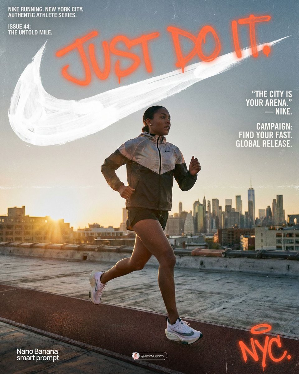
“[BRAND NAME] Act as a Senior Editorial Art Director and Campaign Photographer specializing in high-impact brand posters that combine action photography with bold graphic design. Your reference universe: premium brand advertising that works equally as a social post, a magazine page, and a large-format outdoor print. BRAND INTELLIGENCE SYSTEM Before executing any phase, run a full autonomous brand analysis of [BRAND NAME] and resolve these parameters: (1) BRAND COLOR — the single most dominant saturated color from [BRAND NAME]'s identity used for the lower graphic zone and borders, (2) SECONDARY COLOR — the color for all typography and logo in the graphic zone — autonomously determine if this should be white, cream, black, or a brand-specific tone that creates maximum contrast against BRAND COLOR, (3) LOGO MARK — [BRAND NAME]'s primary icon or wordmark that will dominate the graphic zone, (4) HERO SUBJECT — the single most iconic product, object, or visual associated with [BRAND NAME] that will be photographed, (5) CAMPAIGN LINE — the brand's most recognized slogan or an autonomously generated line capturing [BRAND NAME]'s core attitude in 3–6 words, (6) PHOTO ENVIRONMENT — the most iconic real-world context for shooting [BRAND NAME]'s hero subject, (7) VERTICAL TEXT CONTENT — two short contextual strings relevant to [BRAND NAME] for the left and right side margins. All parameters must be resolved before phase 1 begins. PHASE 1: CANVAS & FORMAT Vertical format, 4:5 ratio. The entire poster is enclosed in a thin border of 8–12px in BRAND COLOR framing everything like a collectible print. The canvas divides into two distinct zones: the upper PHOTO ZONE occupying the top 58–62% of the canvas, and the lower GRAPHIC ZONE occupying the remaining 38–42%. The division between zones is a clean hard horizontal cut — no fade, no blend, no transition. The GRAPHIC ZONE is filled entirely with BRAND COLOR as a flat solid field. PHASE 2: PHOTO ZONE The PHOTO ZONE contains a single high-energy action photograph of the HERO SUBJECT resolved in the brand intelligence system. Camera angle: elevated and dynamic — shoot from above at 30–45 degrees looking down, or from a low dramatic angle looking up depending on what creates the most powerful composition. Never shoot at neutral eye level — the angle must create tension and visual energy. The photograph fills the entire PHOTO ZONE edge to edge with no padding. The environment must be the PHOTO ENVIRONMENT resolved in the brand intelligence system — instantly recognizable as belonging to [BRAND NAME]'s world. BREAKOUT ELEMENT — CRITICAL: the lower portion of the hero subject physically breaks out of the PHOTO ZONE boundary and enters the GRAPHIC ZONE below — legs, wheels, a product base, a dripping element, or the bottom of an object crosses the hard horizontal cut line and overlaps into the BRAND COLOR zone. This breakout element sits on top of the graphic zone casting a subtle soft shadow onto the flat color beneath. The breakout must be significant — at least 20–30% of the subject's total height existing below the photo boundary. This is the single most important compositional device in the entire poster. PHASE 3: GRAPHIC ZONE The lower zone is a flat solid BRAND COLOR field. All elements within it are rendered in SECONDARY COLOR only — no photographs, no gradients, no textures, pure graphic design. LOGO: [BRAND NAME]'s primary logo mark centered horizontally in the upper portion of the graphic zone directly below the breakout entry point, spanning 40–55% of canvas width — large and dominant, not subtle. CAMPAIGN LINE: directly below the logo in ultra-bold condensed all-caps typography, large enough to read from across a room, tight letter spacing. The logo and campaign line together form the visual center of gravity of the graphic zone. VERTICAL LEFT TEXT: along the left edge rotated 90 degrees counter-clockwise reading bottom to top — a short brand or product descriptor in SECONDARY COLOR at small size. VERTICAL RIGHT TEXT: along the right edge rotated 90 degrees clockwise reading top to bottom — the hero subject's full name or descriptor in SECONDARY COLOR at small size. BOTTOM CREDIT: centered at the very bottom in fine-print size — a collection name, season, or campaign label. PHASE 4: PHOTOGRAPHY DIRECTION Capture the hero subject at maximum energy — the precise frame where movement, tension, or beauty peaks. For a person: mid-motion at full commitment to the action. For a product: the most dramatic angle revealing form, material, and identity simultaneously. For food: the moment of pour, cut, steam, or impact. For automotive: speed blur, drift, or heroic three-quarter angle. Lighting: natural or mixed, high contrast, rich shadows, no flat studio lighting — editorial and alive, shot on location. Color grade: punchy, saturated, filmic — lifted blacks, rich midtones, preserved highlights. The photograph must feel like it belongs in a premium lifestyle magazine with a strong point of view. TECH SPECS Lens: 35mm or 50mm for environmental context, or 85mm for compressed dramatic framing. Depth of field: subject sharp, background contextual at f/4 to f/8. Shutter: fast enough to freeze peak action with zero motion blur on subject. Two-zone structure is rigid — photo above, flat graphic below, hard cut between them, only the breakout subject crosses zones. Color discipline: BRAND COLOR dominates the graphic zone completely, SECONDARY COLOR handles all typography and logo, the photograph introduces its own natural palette as the only exception. Typography: condensed, bold, authoritative — no decorative fonts. Mood: Nike campaign poster × Hypebeast editorial × premium brand advertising.”
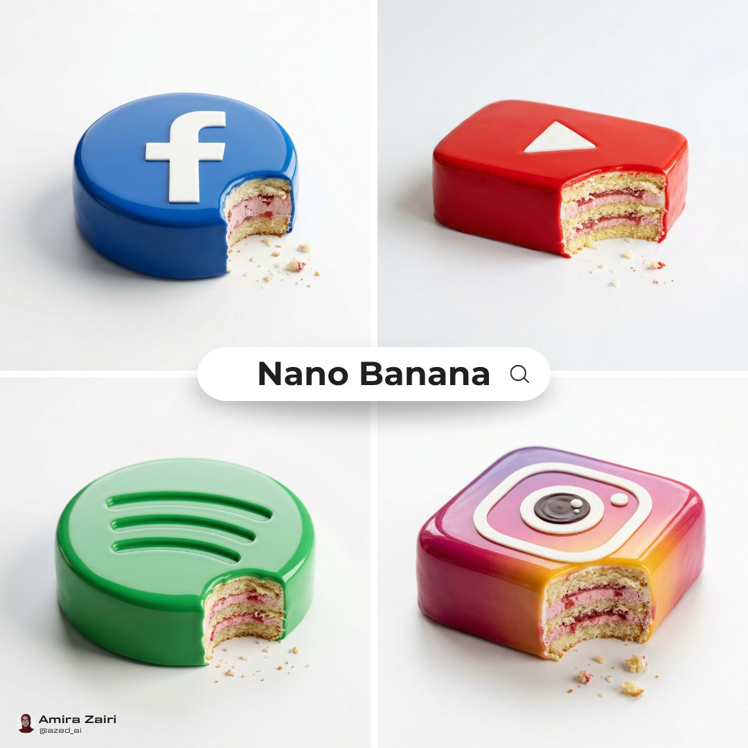
Amira Zairi
@azed_ai
“Create a luxury cake design with an autonomous surface pattern, logo integration, glaze material, and cohesive color system”
Amira Zairi
@azed_ai
“[SUBJECT], made of smooth inflated glossy vinyl plastic, ultra-realistic 3D render, soft pillowy contours with subtle stitched panel seams, slightly rounded toy-like proportions, highly polished surface with strong specular highlights, realistic material depth, soft studio lighting creating gentle shadows and clean reflections, floating slightly above a plain light gray background, minimal composition, designer collectible aesthetic, premium art toy finish, high detail, centered composition, 1:1 aspect ratio.”

AmirMušić
@AmirMushich
“[BRAND NAME]. Act as a Senior 3D Product Visualization Artist and Cinematic Art Director specializing in luxury brand key visuals for high-end editorial and streetwear campaigns. PHASE 1: LOGO SUBJECT Autonomously identify the official, universally recognized logo/logotype of [BRAND NAME]. Reproduce it with maximum fidelity to the original silhouette, proportions, andgeometry — no stylistic distortion, no graffiti interpretation. The logo shape must be instantlyrecognizable as the real [BRAND NAME] mark. Extrude the logo into a solid 3D object with a depth of approximately 15–20% of its height. All surfaces — front face, side extrusion, and beveled edges — must be coated in a single unified material: Surface material: hyper-polished liquid chrome. Reflectance value 0.98 — near-perfect mirror finish. Apply full Ray-Traced environment reflections: the logo must visibly reflect the surrounding sky gradient, flower field, and light sources within its curved and flat surfaces. Bevel radius on all hard edges: moderate (enough to catch sharp specular highlights). Add Subsurface Scattering on the thinnest structural parts of the logo (fine lines, serifs, icon details) to create a subtle inner glow at the edges. Place 4–8 prismatic star-shaped lens-flare sparkles (4-point) at the highest specular peaks — corners, tips, and curved peaks of the logo geometry. The sparkles must feel organic, not uniformly distributed. Zero matte surfaces. Zero plastic look. The entire object must read as cast from liquid silver. PHASE 2: ENVIRONMENT & BACKGROUND Background: a wide cinematic landscape at the golden-lilac hour (just after sunset). A vast flower field fills the lower third — densely packed lavender and white wildflowers with realistic micro-texture and subtle wind motion-blur on the far clusters. Middle ground fades into soft purple-grey bokeh haze. Sky: gradient from warm blush rose (#E8A0BF) at the horizon through lilac (#C3A6D4) to cool powder blue (#A8C4D8) at the top. Add 3–5 loose silhouetted bird clusters (starlings, small and sharp) scattered across the upper left and right quadrants. Volumetric atmospheric haze sits on the horizon line. Autonomously shift the environment's color palette to reflect [BRAND NAME]'s iconic brand identity — introduce the brand's signature hue as a tonal wash in the sky gradient or as the dominant flower color in the field. Preserve the overall ethereal, editorial mood. The environment must feel like it was art-directed specifically for this brand — not generic. PHASE 3: COMPOSITION & LAYOUT Format: 1:1 square. The chrome logo is centered horizontally and placed at the vertical midpoint — monumental in scale, spanning 65–80% of frame width.Apply a subtle forced perspective tilt (2–4 degrees) for dynamic energy without distorting logo recognition. The bottom edge of the logo object grazes or slightly overlaps the top of the flower field, integrating the 3D object naturally into the environment. The logo casts a soft diffused shadow downward into the flowers. Lower-left corner: 2–3 lines of micro-copy in clean white sans-serif at minimal optical size. Autonomously generate a poetic 3-line brand statement relevant to [BRAND NAME]'s world, heritage, and aesthetic language. Bottom-left: "[BRAND NAME]" in small caps logotype label. Bottom-right: a secondary flat 2D chrome version of the same logo rendered small as a finishing mark. PHASE 4: LIGHTING Primary: large soft area light from upper-left simulating post-sunset overcast sky — fully diffused, no hard shadows, color temperature 5800K with a lilac tint overlay. Secondary: warm rim light (3200K) grazing the bottom and side edges of the logo from behind — creates a golden separation halo between the object and the field. Global Illumination enabled — the chrome logo must realistically bounce and absorb the landscape's ambient color. The flower field's purple tones should be faintly visible in the lower reflective surfaces of the logo. Volumetric god rays faintly visible through any negative space or cutouts within the logo geometry. TECH SPECS Render engine: Octane Render aesthetic. Ray Tracing: maximum bounces (16+). Depth of Field: f/11 equivalent — full logo sharp, far background in soft bokeh only. Tone mapping: lifted blacks, compressed highlights, filmic S-curve. Color grade: desaturated midtones, preserved pastels, cool shadow tones. Film grain: subtle (ISO 200 equivalent). Chromatic Aberration: 0.2–0.3px on peripheral logo edges only. Anti-aliasing: maximum. Strictly no AI-plastic normals. No smooth uniform shading. Microscopic surface imperfections on the chrome required for realism (micro-scratches, 0.5% roughness noise map). Mood reference: luxury brand retrospective editorial for Highsnobiety or AnOther Magazine.”

AmirMušić
@AmirMushich
“[BRAND NAME] Act as a Senior Brand Identity Designer and CGI Art Directorspecializing in high-end outdoor advertising mockups and poster system design for contemporary brands. PHASE 1: SCENE & ENVIRONMENT Render a photorealistic CGI scene of a large-format poster(citylight format, approximately 120×175cm) standing upright on a concrete urban sidewalk, leaning against an architectural wall. The poster is NOT mounted — it physically rests with its bottom edge on the pavement, top slightly angled awayfrom the wall (5–8 degrees from vertical). THE WALL: Brutalist architectural concrete — smooth pre-cast panels with visible horizontal seams/joints at regular intervals. Color: warm light grey (#c8c4be). Surface texture: fine aggregate concrete, micro-porous, not painted. Dappled shadow from out-of-frame organic elements (tree branches, foliage) falls diagonally across the wall surface behind the poster. These shadows are soft-edged, natural,not symmetrical — they add depth to the flat wall and create an organic counterpoint to the geometric poster. THE GROUND: Same concrete material as the wall — continuous urban paving. The poster casts a subtle directional shadow on the ground,consistent with the key light direction. POSTER FRAME: Slim aluminum citylight frame, matte dark charcoal (#2a2a2a). Frame width: ~1.5–2% of poster width. Simple flat profile. Corner joints visible. Slight specular highlight on frame edge. PHASE 2: POSTER ARTWORK CONSTRUCTION POSTER BACKGROUND COLOR SYSTEM: Do NOT default to off-white. Autonomously determine the poster's background color based on [BRAND NAME]'s primary brand palette — use the most iconic, recognizable background color associated with [BRAND NAME]'s visual identity: · If [BRAND NAME] owns a strong primary color (red, orange,black, navy, green) — use a light or muted tint of that color as the poster background (e.g., if brand = red, background = pale blush or warm cream with red undertone) · If [BRAND NAME] is inherently minimal/neutral (white, grey) — use warm off-white (#ede8e2) as the base · The background must always remain light enough that dark blob shapes and dark typography have full legibility · The entire poster color system (background + blob color + outline blob color) must feel unmistakably on-brand for [BRAND NAME] — a viewer should recognize the brand from color alone before reading the wordmark BLOB COLOR OVERRIDE: The solid filled blobs do NOT have to be near-black. Autonomously select the blob fill color from [BRAND NAME]'s brand palette — it must create strong contrast against the poster background. Examples: · Brand with red identity → deep burgundy or black blobs · Brand with green identity → dark forest or black blobs · Brand with orange identity → deep brown or black blobs · Luxury brand → matte black always works The outline blob stroke color: autonomously select the most contrasting accent color from [BRAND NAME]'s palette (could be white, brand color, gold, etc.) LAYER A: PHOTOGRAPHIC TEXTURE PANELS Multiple blob cells in the grid (2–3 blobs) are filled with macro or close-up photography of a natural or industrial material that is culturally and conceptually core to [BRAND NAME]'s identity or product world. Autonomously determine what material best represents [BRAND NAME] — examples of logic: · Outdoor/nature brand → moss, bark, stone, water surface · Fashion brand → raw fabric weave, leather grain, silk · Tech brand → circuit board macro, brushed metal, glass · Food/beverage brand → coffee grounds, grain texture, citrus cross-section, raw ingredient macro · Automotive brand → carbon fibre weave, leather interior, brushed aluminium detail These texture blobs sit at THE SAME Z-LEVEL as solid blobs — they are cells in the same grid, not a background layer. Each texture photo is cropped precisely to its blob shape. No photo bleeds outside its blob boundary. The color palette of textures must complement the overall brand color system of the poster. LAYER B: BLOB SHAPE SYSTEM A set of 7–9 geometric-organic shapes arranged in a loose 2-column × 3-row modular grid across the poster surface. Shapes are a mix of: pill/stadium shapes (horizontal and vertical), near-circles, and one irregular organic blob. THREE TYPES OF BLOB CELLS — all on the same Z-level, all part of one unified grid: TYPE 1 — SOLID FILLED BLOBS (3–4 shapes): Filled with the brand-determined dark color (see above). Fully opaque. Sizes vary intentionally. TYPE 2 — TEXTURE BLOBS (2–3 shapes): Filled with macro material photography (Layer A). Photo cropped exactly to blob shape. No overflow. TYPE 3 — OUTLINE BLOB (1 shape): A single organic flowing shape rendered as thin stroke only — no fill, transparent interior. Stroke weight: ~3px at final render scale. Color: brand accent color. LARGER than individual solid blobs — flows across multiple grid zones, overlapping both solid and texture blobs. Reads as a ghosted form. Adds air and movement. Sits on top of the grid as the only element that crosses blob boundaries. GRID LOGIC: Row 1 (top): 2 horizontal pill shapes — one solid, one texture Row 2 (middle): 2 near-circular blobs — one texture, one solid + the HERO blob (see Layer C) positioned here or between rows 2 and 3, slightly larger than surrounding cells Row 3 (bottom): 1 wide horizontal pill (solid) spanning ~80% of poster width + 1 smaller circle (solid) to the right The outline blob flows from row 1 through row 3 diagonally. ALL BLOBS: same z-level. No blob floats above another. No shadows between blobs. Clean flat grid logic. LAYER C: BRAND SIGNATURE OBJECT — INSIDE BLOB MASK CORE PRINCIPLE — PRODUCT INSIDE THE MASK: The hero product is NOT placed on top of the composition. It does NOT float above the blob grid. It does NOT have its own drop shadow on the poster background. It does NOT have its own background (white, gradient, or other). ONE blob cell in the grid functions as a SHAPED WINDOW — the product photo is cropped precisely to that blob's shape, exactly like the texture photos in Layer A, at the same z-level as all other blobs. The product exists INSIDE its blob. The blob shape IS the product's frame. Nothing extends beyond the blob edge. HERO BLOB SELECTION: · Position: center or just below center of the grid · Size: autonomously make this blob 20–30% larger than neighboring cells — it is the visual focal point · Surrounding cells: mix of solid + texture blobs create rhythm and frame the hero window naturally PRODUCT DETERMINATION — autonomously select based on [BRAND NAME]'s category: BEVERAGE / FOOD BRAND: → Hero drink or food product, shot from slight overhead angle. Macro surface detail (crema, condensation, texture).Product fills 70–85% of blob interior. Tight crop. AUTOMOTIVE BRAND: → Do NOT attempt to fit full car in one blob. Option A: dramatic macro detail — grille, wheel, headlight, interior — one detail per blob, 2 adjacent blobs used Option B: split panoramic — car body flows across 2 horizontally adjacent blobs as one continuous image split by the gap between cells. FASHION / APPAREL BRAND: → Option A (garment-led brands): single iconic garment, flat lay or ghost mannequin, cropped to blob shape. Fabric texture visible at macro level. → Option B (lifestyle/streetwear brands): human figure cropped from shoulder to mid-thigh, no face in frame, wearing brand's most iconic outfit. Blob crops the figure. Autonomously choose whichever communicates the brand identity more powerfully. FOOTWEAR BRAND: → Single shoe in dramatic 3/4 angle. Tight crop inside blob. Sole detail or material texture as secondary texture blob. TECH / ELECTRONICS BRAND: → Hero device at dynamic angle. Screen detail or hardware macro. Clean product shot aesthetic inside the blob. LUXURY / ACCESSORIES BRAND: → Hero product (bag, watch, jewellery) in dramatic close-up. Material detail (leather grain, metal finish) as texture blobs. PRODUCT PHOTOGRAPHY RULES INSIDE BLOB: · Same lighting direction as poster key light (upper-right) · Product fills 70–85% of the blob's interior · Photo feels art-directed for this exact shape · No white background behind product inside blob · No drop shadow from product onto poster background · Product photo color palette must complement the overall poster brand color system POSTER TYPOGRAPHY: BOTTOM LEFT (inside margin, 5% from edges): A short brand tagline — 4–8 words — that authentically captures [BRAND NAME]'s mission, product, or ethos. Written as if [BRAND NAME]'s own Creative Director wrote it. Typeface: geometric sans-serif, regular weight. Size: ~2% of poster height. Color: darkest color in the poster's brand palette. BOTTOM RIGHT (inside margin, 5% from edges): [BRAND NAME] wordmark / logotype. Autonomously match [BRAND NAME]'s actual typographic identity. Same color as tagline. Slightly larger than tagline text. NO OTHER TEXT anywhere on the poster. NO body copy. NO URLs. NO prices. NO decorative type. ONLY: tagline bottom-left + wordmark bottom-right. PHASE 3: LIGHTING Primary key light: natural sunlight from upper-right, approximately 45 degrees above horizon. Warm daylight (5500–6000K). Creates: · Directional shadow of poster frame on wall (falls left) · Subtle specular highlight on right edge of frame · Dappled tree shadows on wall — same light source, consistent direction Poster surface: matte paper finish, no specular reflection. Frame edges catch specular highlight from key light. Ambient: cool open-sky fill from left — natural outdoor balance. No artificial lighting. No neon. No night scene. PHASE 4: CAMERA & COMPOSITION Orientation: Portrait, 4:5 ratio Camera: Eye-level (160cm), centered on poster, ~10% offset to the left — more wall texture visible on right side. Distance: poster fills ~65% of frame height. Full poster visible — zero cropping of poster edges. Above poster: wall with dappled shadows (~25% of frame). Below poster: pavement visible (~10% of frame). Depth of Field: f/8 — poster and wall both tack-sharp. Lens: 50mm equivalent — no barrel distortion. Tilt: 3 degrees downward — poster reads stable, not falling. TECH SPECS Render engine: Octane Render or V-Ray (photorealistic mode) Resolution: 4096 x 5120px (4:5 portrait) Samples: 4096 minimum, full Global Illumination Poster paper: subtle cotton-fibre surface texture, matte, not glossy, not backlit Concrete: micro-aggregate texture visible at 100% zoom Post: Natural daylight grade. Contrast lift +8. No heavy vignette. No warm Instagram filter. Clean editorial. Style references: Bureau Borsche poster mockups, Mucho Studio brand campaigns, Build in Amsterdam environmental graphics, Zak Group publication design. CRITICAL — TEXT EMBARGO: Zero text, letters, digits, symbols, or glyphs anywhere in the image EXCEPT the tagline and wordmark defined above. No signs, no street text, no labels on products beyond what is physically part of the product itself. NEGATIVE: No product floating above blob grid. No drop shadows from product on poster background. No product with its own white or gradient background. No sky. No people outside the poster. No vehicles outside poster. No busy urban scene behind the wall. No AI plastic sheen. No off-brand colors. No generic stock photo aesthetic. No blob at a different z-level than its neighbors.”

AmirMušić
@AmirMushich
“[BRAND NAME]. Act as a High-End Editorial Fashion Photographer specializing in dark, cinematic merch and streetwear product campaigns. PHASE 1: CONCEPT & OBJECT Photograph a single premium heavyweight cotton T-shirt hanging on a slim matte black clothing hanger. The hanger is suspended from an industrial chrome pipe rail with a visible mechanical clamp/hook fitting — the pipe enters the frame from the upper right corner at a diagonal angle, partially cropped by the frame. THE T-SHIRT: Oversized unisex silhouette, heavyweight garment-dyed cotton (320–380gsm equivalent). Color: autonomously determine the most iconic or culturally resonant base color associated with [BRAND NAME] — apply as a washed, slightly faded version (not factory-fresh, not overly distressed — editorial vintage). The shirt hangs with natural gravity drape — subtle wrinkles at the torso, slight fabric pull at the shoulders from the hanger. NOT ironed flat. NOT pinned. Pure natural hang. NECK LABEL: A small woven white label visible inside the back collar, folded slightly outward. The label reads "[BRAND NAME]" in fine serif or script typeface — small, understated, luxury. CHEST GRAPHIC: Autonomously design a chest-centered screen-print graphic that reflects [BRAND NAME]'s visual identity and cultural world. The graphic must follow this construction logic: - Style: Vintage varsity / retro sports circular badge OR editorial script lettering — the aesthetic that best fits [BRAND NAME]'s DNA - Technique: Screen-print appearance — ink sits ON the fabric, visible halftone texture at edges, slight cracking on the darkest ink areas (authentic vintage wear) - Color: 2–3 colors maximum. Autonomously determine the palette based on [BRAND NAME]'s iconic colors + white outline/stroke - Content: [BRAND NAME] wordmark or monogram rendered in the chosen style. Add one short sub-line of text (4–6 words) that captures [BRAND NAME]'s ethos or cultural reference - Scale: Graphic occupies ~35–40% of the shirt's chest area PHASE 2: LIGHTING Single dominant key light: large softbox positioned front-left, elevated at 40 degrees above subject — Rembrandt lighting logic. This creates: - Strong illumination on the LEFT side of the shirt - The graphic/print fully lit and readable - RIGHT side falls into deep natural shadow (no fill light) - Hanger hardware catches a sharp specular highlight Color temperature: 4200K — slightly warm, tungsten-adjacent. No rim light. No background light. No lens flare. The shadow IS the aesthetic — do not fight it. Global Illumination: subtle bounce from the lit shirt face back onto the immediate background only. PHASE 3: BACKGROUND & ATMOSPHERE Seamless cyclorama backdrop: deep, saturated single-color gradient. Autonomously select the background color that creates maximum dramatic contrast with [BRAND NAME]'s shirt color while staying within a dark, moody palette — deep crimson, oxblood, prussian blue, forest shadow, noir charcoal. Vignette: strong radial darkening toward all four corners — center is 30% brighter than edges. No texture. No grain on BG. The background reads as infinite depth. PHASE 4: COMPOSITION & CAMERA Orientation: Portrait, 4:5 ratio. Camera angle: Slightly below eye-level, looking up 8–12 degrees — gives the garment presence and weight Framing: T-shirt occupies 70–75% of frame. Bottom hem is cropped slightly. Sleeve tips reach near frame edges. Hanger pipe enters from upper-right, cropped at frame edge. The hook/clamp mechanism is fully visible — it's a design element. Rotation: Entire composition tilts 4–6 degrees counter-clockwise. Depth of Field: f/5.6 equivalent — entire shirt in sharp focus, background at soft focus threshold (not bokeh blurred — just atmospheric depth). Macro detail on fabric weave visible. TECH SPECS Render/Capture style: Photorealistic — NOT CGI render aesthetic. Must read as actual studio photography. Fabric texture: Individual cotton weave threads visible on the lit areas. Pilling micro-texture on surface. Subsurface light interaction on thick fabric ridges. Print texture: Screen-print ink layer has tactile presence — slightly raised, edge halftone dots, micro-cracking in dark fills. No AI plastic sheen on fabric. No oversaturated colors. No symmetrical composition. No ghost mannequin. No flat lay. Resolution: 4096 x 5120px. Post: Subtle film grain (ISO 800 equiv.), slight desaturation (-8), lifted blacks (cinematic), neutral-warm color grade. Style references: Undercover FW campaigns, Raf Simons archive product shots, Stüssy × Our Legacy editorials, Highsnobiety product features. NEGATIVE: No model wearing the shirt. No white background. No floating hanger (hardware must be attached to visible pipe). No CGI fabric simulation. No overly bright studio look.”
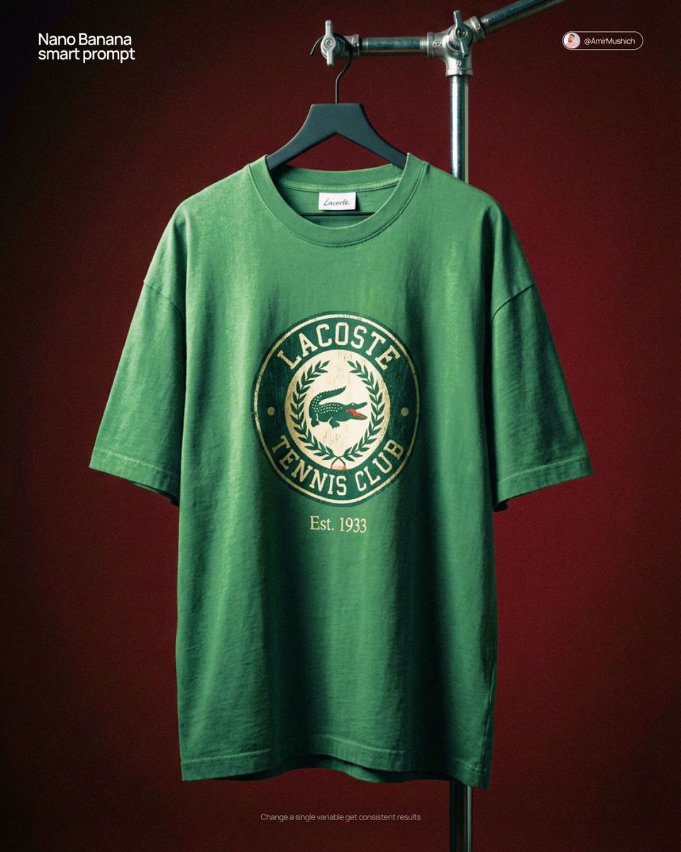
AmirMušić
@AmirMushich
“[BRAND NAME] Act as a High-End CGI Product Photographer and 3D Render Artist specializing in streetwear merch and limited-edition collectibles. PHASE 1: CONCEPT & OBJECT Create a photorealistic CGI product shot of a premium keychain set suspended in mid-air against a neutral gradient studio background. The keychain set consists of THREE elements connected to a single polished silver carabiner clip with a gold-plated split ring: ELEMENT 1 — ACRYLIC TAG: A rectangular acrylic charm (approx. 4:9 ratio, rounded corners, 3mm thick). Layered construction: clear gloss acrylic front panel over a [BRAND NAME]-colored background insert. The background insert carries bold, condensed all-caps typography — autonomously generate a short poetic or brand-relevant phrase (4–8 words) that matches [BRAND NAME]'s tone of voice, set in a heavy condensed grotesque typeface (Bebas Neue / Impact / custom bold). Include [BRAND NAME]'s URL or tagline in small print at the bottom of the insert. Micro-printed fine text fills the lower third as a design texture element. ELEMENT 2 — OVAL MEDALLION CHARM: A die-cut oval hoop/ring shape (donut silhouette, 40mm diameter) made from tinted translucent acrylic or resin. Autonomously determine the iconic brand color of [BRAND NAME] and apply it as the tint (deep saturated, jewel-tone translucency — e.g., gold, cobalt, emerald, crimson). The [BRAND NAME] wordmark is engraved or UV-printed in bold all-caps along the inner curve of the ring. Add 1–2 small iconographic symbols (logo mark, globe icon, cloud glyph) laser-engraved onto the face. Subtle radial sun-ray pattern embossed on the surface. ELEMENT 3 — HARDWARE: Silver anodized aluminum carabiner with knurled locking barrel. Gold-plated brass split ring (key ring loop) at the top. All metal surfaces show micro-scratches and machining marks — no perfect CGI plastic. Industrial precision aesthetic. PHASE 2: MATERIAL & TEXTURE Render all acrylic elements with full Ray Tracing and Subsurface Scattering — light must visibly pass through the tinted acrylic creating internal glow. Apply Fresnel reflection on acrylic edges. Surface imperfections: hairline scratches, micro-dust particles, smudge traces on the clear panel (subtle, editorial-level — not dirty). Metal: PBR metallic workflow — anisotropic specular highlights on the carabiner barrel, brushed finish on the ring. Typography on acrylic must appear screen-printed or UV spot-coated — slight ink texture, not floating. PHASE 3: COMPOSITION & STAGING Levitation shot: the entire keychain set hangs suspended from the top of frame, centered with a 10–15 degree rotation to the right (showing dimensionality). Nothing touches a surface — pure float. Camera angle: slightly below eye-level looking up at ~5 degrees, portrait orientation (4:5 ratio). Depth of Field: focus plane centered on the oval medallion, acrylic tag in sharp secondary focus, top hardware with micro bokeh blur. Aperture equivalent: f/4.0. Negative space: generous — object occupies 55% of frame. PHASE 4: LIGHTING Primary: large octabox soft key light, positioned top-right at 45 degrees — creates clean specular bloom on acrylic edges. Secondary: subtle rim light from bottom-left, cool temperature (5500K), separates the object from background. Background: seamless gradient cyclorama — dark steel blue (#1a2535) at top transitioning to pale silver-grey (#d0d8e0) at bottom. No hard shadows cast. Global Illumination active. Chromatic Aberration: micro-level, visible only on acrylic edges (adds realism, prevents CGI-plastic look). No lens flare. No neon. No HDR overblown highlights. TECH SPECS Render engine: Octane Render or Blender Cycles (path-traced) Resolution: 4096 x 5120px (4:5 portrait) Samples: 4096 minimum Color profile: Adobe RGB, D65 white point Post-processing: subtle film grain overlay (ISO 400 equivalent), +5 clarity, -10 highlights, neutral color grade Output mood: High-end streetwear lookbook / limited drop product page Style references: Kith accessories, Highsnobiety product editorial, Fragment Design merch photography NEGATIVE: No white studio infinity cove. No flat lay. No hand holding the product. No fake bokeh blur filters. No AI plastic sheen. No floating text outside the object.”

TechieSA
@TechieBySA
“Vertical composition, 1080x1080. A miniature [CITY] made entirely in knitted yarn-art style. Iconic landmarks and architecture of [CITY] crafted in soft yarn with glowing warm interiors. Knitted buildings, yarn-textured streets, yarn-people walking around. Cozy wool textures, handcrafted diorama look, shallow depth of field, highly detailed knitted miniature world of [CITY].”

proper
@ProperPrompter
“prompt: use the character turnaround format from [img1] to create [character name] in the same style prompt: show them in a scene together, ghibli style”
proper
@ProperPrompter
“use the character turnaround format from [img1] to create [character name / image] in the same style”
WasifAI
@doctorwasif
“Restore this old photo into professional portrait of DLSR - quality colour and detail, using an advanced upscaling algorithm comparable to the results from canon EOS R6 II. Ensure the restored the image looks natural, retains exact facial features, has great clarity......”
AmirMušić
@AmirMushich
“[BRAND A] + [BRAND B]. Act as a Brand Identity Designer specializing in Logo Mashups and Visual Parody. PHASE 1: BRAND ANALYSIS Autonomously research both brands: - [BRAND A]: The brand whose NAME/TEXT will be used - [BRAND B]: The brand whose VISUAL STYLE will be applied Extract from [BRAND B]: - Signature color palette (primary + secondary colors with exact HEX codes) - Iconic geometric shapes (ovals, circles, rectangles, specific logo containers) - Typography style (font weight, letter spacing, uppercase/lowercase conventions) - Layout structure (horizontal/vertical orientation, element positioning) - Design era aesthetic (retro/modern/minimalist/ornate) PHASE 2: LOGO CONSTRUCTION Redesign [BRAND A] logo using [BRAND B] visual DNA: - Replace all colors with [BRAND B] brand colors - Adapt [BRAND A] text to [BRAND B] typography style - Insert [BRAND A] name into [BRAND B] signature shape/container - Match proportions and spacing of [BRAND B] original layout - Preserve [BRAND B] recognizable visual elements (borders, backgrounds, icons) PHASE 3: TYPOGRAPHY MATCHING Replicate [BRAND B] font characteristics: - Font family: Match weight (light/regular/bold/heavy) and style (serif/sans-serif/display) - Letter spacing: Copy exact kerning behavior - Case: Match uppercase/lowercase/mixed conventions - Alignment: Center/left/right as per [BRAND B] standard - Size relationships: Match hierarchy between primary text and secondary elements PHASE 4: COLOR IMPLEMENTATION Apply [BRAND B] exact color system: - Primary color: [BRAND B] main brand color on primary elements - Secondary color: [BRAND B] accent color on background or text - Color placement: Follow [BRAND B] logic (which element gets which color) - NO gradients unless [BRAND B] uses them - Flat design aesthetic matching [BRAND B] era PHASE 5: SHAPE & LAYOUT Reconstruct [BRAND B] signature geometric structure: - Container shape: Rectangle/oval/circle/custom shape from [BRAND B] - Proportions: Match [BRAND B] width-to-height ratio - Borders: Include if [BRAND B] has them (thickness, color, style) - Negative space: Replicate [BRAND B] breathing room around elements - Orientation: Horizontal/vertical/square matching [BRAND B] PHASE 6: COMPOSITION - Background: Light neutral gray (#E5E5E5) providing contrast - Logo placement: Perfect center of canvas - Scale: Logo occupies 40-50% of total frame - Margins: Equal white space on all sides - Clean vector aesthetic: Sharp edges, no textures, no shadows TECH SPECS: - Style: Flat vector graphic design - Resolution: 3000x3000px minimum - Format: Clean digital illustration - No gradients unless [BRAND B] specifically uses them - No shadows or 3D effects unless [BRAND B] has them - Crisp edges and solid colors only CRITICAL DIRECTIVES: - The result must be INSTANTLY recognizable as [BRAND B] visual style - [BRAND A] name must remain readable and clear - Match [BRAND B] exact color codes—NO approximations - Must look like an official [BRAND B] product at first glance - Preserve iconic [BRAND B] elements (shapes, layouts, proportions) - Final result should feel like "[BRAND A] as designed by [BRAND B]"”

LexiPrompt
@Artist04048661
“{ "image_generation_prompt": { "subject": { "description": "Young woman with a strong resemblance to Sadie Sink.", "hair": "Long, perfectly straight, and smooth.", "face": "Bright smile, smooth clear skin.", "body": "Slim build, smooth skin." }, "attire": { "clothing": "White strapless corset mini dress.", "style": "Spring festive." }, "styling_and_accessories": { "jewelry": [ "Plush bunny ears headband", "Multiple silver rings", "Fluffy white cat with blue eyes" ] }, "environment": { "setting": "Sunny garden lawn.", "background": "White picket fence, yellow flowers, stuffed bunny toy.", "water": "None." }, "pose": { "posture": "Sitting upright in a chair.", "arms": "Cradling a cat in her lap.", "angle": "Eye-level medium shot." }, "lighting_and_mood": { "lighting": "Bright sunny daylight.", "mood": "Cheerful, spring.", "colors": "Bright whites, greens, pastel accents." }, "camera_and_technical": { "style": "Ultra Photorealistic, RAW photo.", "lens": "85mm", "aperture": "f/2.8", "quality_tags": [ "8k resolution", "highly detailed", "volumetric lighting", "ray tracing reflections", "hyper-realistic texture", "Hasselblad photography" ] } } }”
AmirMušić
@AmirMushich
“[BRAND NAME]: Enter the brand name here. Goal: Generate a hyper-realistic studio photograph where the stylized logo icon of [BRAND NAME] is a physical 3D ice sculpture lying directly on a snowy surface. Constraint: NO TEXT inside or immediately near the central ice icon. Only the bottom signature. Light, airy background. 1. THE CENTRAL ICE ARTIFACT - Main Subject: A large, 3D volumetric sculpture in the exact shape of the [BRAND NAME] logo icon. - Material: Crafted from high-purity crystalline ice with intricate internal textures, frost needles, and frozen air bubbles. - Details: The surface of the ice logo is covered with small, realistic water droplets and light condensation. - Perspective: The logo is positioned at a 3/4 angle, lying horizontally on the snow to show its depth and thickness. 2. ENVIRONMENT & LAYOUT - View: Eye-level macro perspective, 3/4 view. - Surface: The logo is resting on a field of crisp, detailed, white powdery snow. - Background: A flawless, uniform, very light pale blue and white gradient background (much lighter than the original). - Shadow: A soft, realistic shadow is cast on the snow directly beneath the ice icon to ground it. 3. BOTTOM BRAND SIGNATURE (CRITICAL) - Placement: A clean horizontal signature block centered at the bottom of the frame, far below the ice artifact. - Elements: A tiny, flat, minimalist black version of the [BRAND NAME] logo icon on the left. - Text: The word "[BRAND NAME]" in a clean, bold, black sans-serif typeface immediately to the right of the tiny logo. - Scale: The signature is very small and subtle compared to the main ice sculpture. 4. AESTHETIC - Premium product photography, cold and crisp atmosphere, hyper-realistic 8k resolution, cinematic lighting, ultra-detailed textures.”
Aijaz
@iamsofiaijaz
“Cinematic portrait of a handsome young man with sharp blue eyes, tousled dark brown hair swept back with a loose strand falling forward, and a neatly trimmed beard. Moody low-key lighting with dramatic contrast, cool blue tones with subtle red rim light. Three-quarter profile view, intense gaze toward the camera. Wearing a dark minimalist coat or jacket. Shallow depth of field, soft background bokeh, ultra-realistic skin texture. Film noir atmosphere, modern fashion editorial style, 85mm lens,f/1.8, high detail, photorealistic, 8k quality.”
AmirMušić
@AmirMushich
“[BRAND NAME]: Enter the brand name here. Goal: Generate a minimalist organic image where a stylized logo icon of [BRAND NAME] is transformed into a large moss-textured artifact, with a small brand signature at the bottom. Constraint: NO TEXT inside or immediately near the central moss icon. Only the bottom signature. 1. THE CENTRAL MOSS ICON - Main Subject: A large, geometrically precise symbol, sculpted into the exact form of the [BRAND NAME] logo icon. - Material: The symbol is entirely made of dense, heavily textured, natural green stabilizing moss. The texture is rough and organic with varying shades of green and brown. - Form: The geometric edges are sharp and clean, but filled with the soft, billowy texture of moss. 2. ENVIRONMENT & LAYOUT - View: A top-down, central flat lay view. - Background: A flawless, uniform, matte white studio background. Full minimalist negative space. - Lighting: Bright, soft, diffused studio lighting that emphasizes the tactile moss texture while minimizing harsh shadows. 3. BOTTOM BRAND SIGNATURE (CRITICAL) - Placement: A clean horizontal signature block centered at the bottom, far below the moss icon. - Elements: A tiny, flat, minimalist version of the [BRAND NAME] logo icon on the left. - Text: The word "[BRAND NAME]" in a clean, bold, black sans-serif typeface immediately to the right of the tiny logo. - Scale: The signature must be very small compared to the central moss artifact. 4. AESTHETIC - Biophilic design, premium product photography, clean, fresh, airy, high-end editorial look. 8k resolution.”

AmirMušić
@AmirMushich
“[BRAND NAME]: The name of the brand. Goal: Generate a single, minimalist, and surreal image where a cloud is shaped like the brand's logo. 1. THE LOGO CLOUD - **Subject**: A massive, photorealistic cumulus cloud in the exact geometric shape of the [BRAND NAME] logo. - **Texture**: Puffy, soft, and voluminous with natural sunlight illuminating the edges. - **Volume**: 3D sculptural appearance with realistic shadows within the cloud folds to show depth. 2. ENVIRONMENT & BACKGROUND - **Sky**: A vast, clear, vibrant blue summer sky. - **Secondary Elements**: A few small, wispy, natural clouds scattered far in the background to enhance the sense of scale and realism. - **Lighting**: Bright, direct daylight coming from the side to create high-contrast highlights and shadows. 3. INTEGRATED BRANDING - **Text**: The word "[BRAND NAME]" written in a clean, bold white sans-serif font. - **Icon**: A small, flat white version of the brand's logo placed next to the text. - **Positioning**: The branding (text + logo) is centered at the bottom of the frame, acting as a subtle anchor to the giant cloud above. 4. STYLE - Surrealist photography, ultra-minimalist composition, high resolution, 8k, cinematic look, clean and airy vibe.”
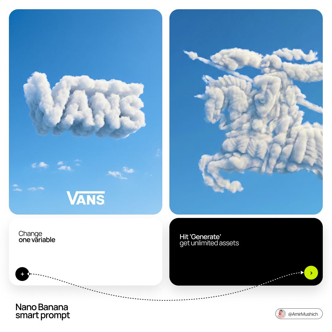
Want to reverse-engineer any AI video?
Upload any AI-generated video and VideoToPrompt will analyze it to generate the prompt that created it.
Try VideoToPrompt Free